Business Card printing offers a truly unique way to make a powerful first impression.
With such little space, it’s important to know what to include. Everything on your design should earn the right to be there. Printing double-sided will afford you more space to inject your product with your identity.
A perfect Business Card brings a checklist of essential elements together. Here are twelve things we believe you should always make room for on your cards. Each ingredient of this recipe is equally important and warrants its place in your print.
1. Company name
Your company name is a critical detail. Without a name, Business Card receivers won’t know who it came from. With the standard Business Card size being small offering limited space, a strong name should include what services you offer to your customers. Give your name room to breathe in your design, so it has enough space to soak up maximum attention.
As a general rule, your company name is usually the largest piece of text on your design, as this is what people will remember most distinctly. Be clear; Gregg’s The Bakers tells your customers what you do better than Gregg’s. Likewise, Essex Scaffolding Company is more obvious to your recipients than ESC.
2. Logo
A great logo becomes the centrepiece of a brilliant Business Card. If you’re printing double-sided, ensure your eye-catching logo sits firmly on the front of your design for maximum impact. This is your chance to show what you do without saying a word. Use your limited space wisely and captivate your customers with a powerful design. If a picture can speak a thousand words, so can your logo.
Use a vector image so you can scale up or down the size of your image infinitely without affecting its quality or detail.
3. Role
If you’re giving Business Cards out personally, let your customers know who it’s from. When they get in touch with your business, they’ll have a contact to speak with directly. By creating this personal relationship, a prospect is more likely to become a client.
If your company name doesn’t specify what you offer, your job title is an alternate place to do this. If your company is called Susan’s Designs, this leaves some ambiguity. Label your job role more clearly: graphic designer, interior designer, fashion designer etc.
4. Slogan
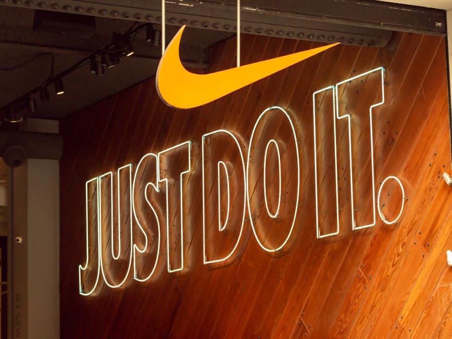
Use a select few words to further specify the products or services you provide. Typically, slogans and taglines are short phrases with the most famous ones being three words long such as McDonalds’ “I’m Loving It” or Nike’s “Just Do It”.
Use this line of copy to highlight what you specialise in. If you’re designing a gardening Business Card, a tagline such as ‘quick garden makeovers’ would tell your customers exactly what you do. Something a childminder Business Card could have as a slogan is ‘Learn. Play. Grow.’. If you’re writing yours from scratch, you can check out our 6 tips for how to write advertising slogans that sell.
5. Contact details
Another essential element to this recipe is your contact information. Without them, how can your prospects get in touch and take further action? For them to become a client, they need to be able to get in touch with you. Leave whichever contact details you check the most, whether that’s your phone number or email address. Typically, the aforementioned are the two most likely ways for your customers to reach you. If you provide more than one means of communication, place them in order of your preference.
6. Address
A geographical address is not always necessary, but every business should feature its website. This is a great place to direct your customers from your Business Cards. If your print has performed its job and piqued the interest of your prospects, your website is the perfect place for them to gather more information.
Depending on what your business does, it can also be relevant to include your physical address in the form of a postcode, street name and property number. If your business requires attendance in person, such as a nursery, including a physical address is a smart approach.
7. Social Media
Social media icons for Business Cards provide a great next step for your customers if they’re interested in seeing more, much like adding your website URL. If your business is very visual, include your Instagram so your customers can see more of what you offer. If your business is more informational or educative, include your Twitter so your clients can read and learn more. Include what you believe is best suited to your audience, whether that’s Facebook, LinkedIn or YouTube. These icons are great to feature on the back of a Business Card.
8. Clear font
Writing in a clear, easy-to-read font may sound like simple advice but it works. Being over-elaborate with your font not only makes your Business Card hard to read but it loses the attention and interest of those you’re seeking to impress. Great design can’t exist without equally great copy and typography. Check out this guide if you want help picking from the best free fonts.
9. QR code Business Cards
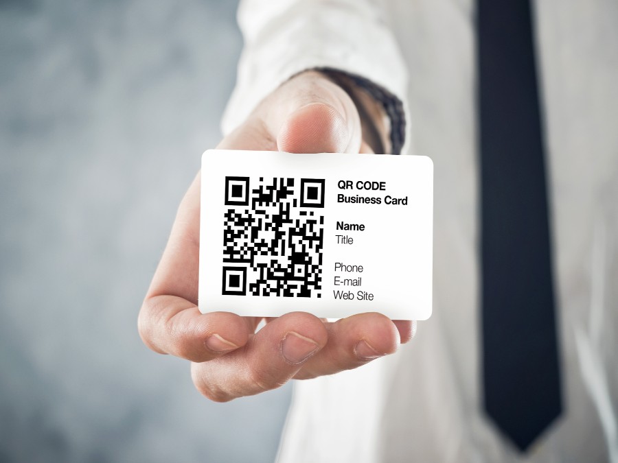
One of the advantages of Business Cards is the ability to add a QR code that offers your customers an effortless solution if they want to take action. By simply taking a photo of your QR code Business Card, they can be instantly directed to wherever you deem most important. Websites and social media are the most common places to send customers.
However, get creative! Why not use a unique code to send them through to a competition as part of your marketing push through your Business Cards? If you don’t know your Static from your Dynamic, you might want to read our QR code guide to avoid common pitfalls.
10. White Space
Great Business Card design uses space efficiently. Smart use of space means everything earns its place in the design. It also means the final product doesn’t look overcrowded, chaotic and confused. Leaving space on your Business Card allows your design to breathe and can further highlight the existing details. It shows care has been put into its creation by not having everything thrown into it. Sometimes the best-tasting cakes have the fewest ingredients.
11. Call to action
A call to action (CTA) is your chance to tell your customers what you want them to do next. You may have already done it by adding your contact details, address, social media or QR code. If not, direct your customers to where you want them to go next. If you’re pushing a particular campaign or product, provide a unique URL to the specific landing page. Or, if the next step is for them to check your social media, make it clear whether you want them to follow, like, subscribe, or simply just to take a further look at what you offer.
12. Business Card Finishing options
After your design has been finalised, one tip that comes into play is your finishing options. Here, you have several options to take your Business Card to the next level. Choosing the right paper stock and finishing type is crucial to get the print you desire. For a luxurious look, consider choosing Foil Business Cards. Equally, our Cheap Business Cards, on 400 gsm silk, remain hugely popular when you have a smaller budget but still have high expectations for your end product.
So, now you know what information to put on a Business Card. When you’ve completed your design using our free Business Card templates, we’re here to deliver high-quality print every time.


