The design of a restaurant or takeaway menu is crucial when trying to attract new customers and keep existing diners interested.
An eye-catching style can say a lot about the food you serve and the tastes customers can expect.
Looking for inspiration? Here are our 10 favourite restaurant and takeaway menu design ideas to help you get started.
Menu design ideas that tell a story
One of the most important aspects of your menu design is your brand story. What makes your business unique? Here’s a few ideas that manage to express that.
1. Hubbly Bubbly, Orlando, USA
One of the most important aspects of your menu design is your brand story. What makes your business unique? Here’s a few ideas that manage to express that.
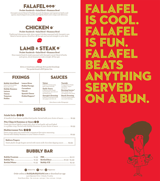
This Orlando-based restaurant has a mission to make falafel famous, reflected in their bright and colourful menu.
The light-hearted poem is fun and friendly, while still encouraging customers to ditch the burgers and try the vegan way.
Hubbly Bubbly has even created a cartoon character, George. Named after the original owner, he features throughout their branding as a nod to their company history – creating a familiar face people associate with the business.
2. Fade Street Social, Dublin
A rare place, with some of the best food I’ve ever had the pleasure of looking at from afar away, crying and salivating – because I can never get in! The bookings here are usually 2-3 months booked in advance, so if you fancy a giant, sexy burger with all the trimmings, make sure you book ahead. Their menu design is minimal, straight to the point, chalkboard black and white, no pretences here, you know you’re going to get good food.
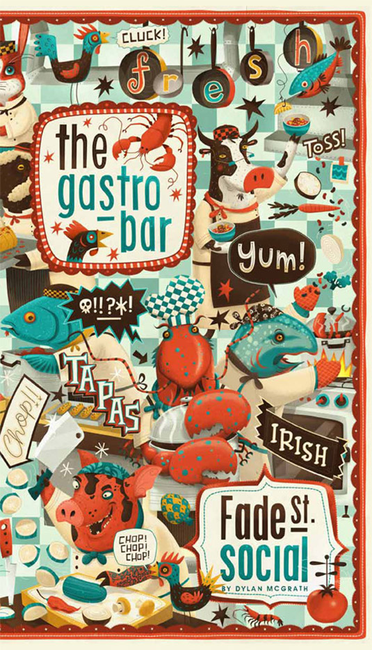
At first glance, there’s plenty going on in this quirky tapas bar menu. Designed by Steve Simpson, the illustrations convey a sense of food-themed fun, showcasing the venue’s sense of humour and Irish character.
The various characters and elements which make up the menu are designed to encourage guests to embrace different flavours and experiment with their choices.
If your restaurant has a distinct personality, emphasise it with your menu design and illustrations.
3. Sketch, London
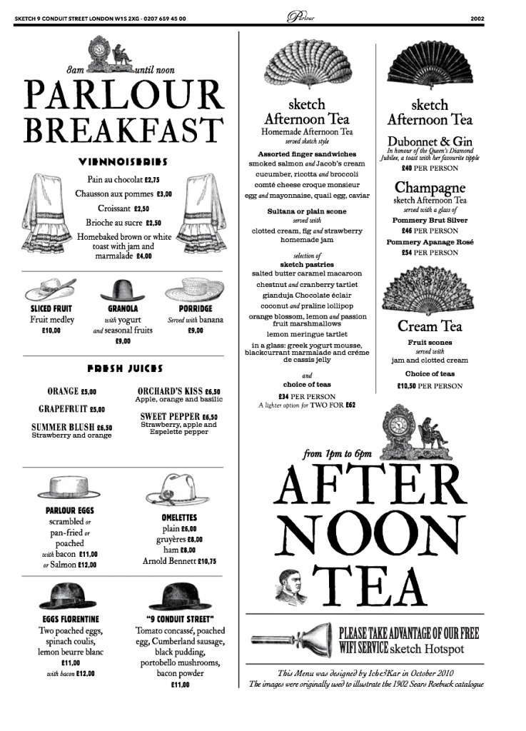
This beautifully illustrated Parlour Breakfast menu transports its customers back to the late 1800s wild-west, with cowboy hats and ladies with fans. You can almost smell the tobacco, gin and talcum.
Each menu choice is represented with a different style of hat or fan. This helps separate different parts of the menu in a unique way when a customer selects a dish.
The menu design matches perfectly with the restaurant’s interiors, which are elegantly dressed with historical artwork and furnishings from that period.
Top tip: Menu design ideas that follow a theme
While a striking menu design will help you attract attention, if it isn’t on-brand, your restaurant theme may get lost. The best menus are the ones which work together on both print and digital.
4. The Drift Bar, London
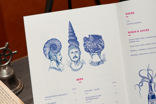
Declaring themselves a ‘sanctuary in the chaos of London’, this restaurant’s circus tent and butterfly house menu effortlessly matches its decor and attitude.
The little details of this menu bring it to life. Its design encourages customers to drift a little further into their imagination – much like the mystery and excitement of a circus.
This message is also clear across its website, social media and interior designs with whimsical touches throughout.
5. The Pelican, Singapore
There’s nothing sketchy about Sketch, their beautifully illustrated “Parlour Breakfast” menu puts you back in the late 1800’s wild-west, with lace, and ladies with fans, you can almost smell the tobacco, gin and talcum.
This menu reflects perfectly the golden age of sea travel, and is an ideal choice for this bay-side restaurant in Singapore.
The illustrations create a feeling of tradition and authenticity that reflects the restaurant’s vintage interiors and its nautical-themed website.
It’s a brilliant example of how you can maintain a theme in your restaurant location and across digital and print without distracting from the amazing dishes on offer.
Top tip: Menu design ideas outside the box
Breaking away from a traditional card layout can set your restaurant apart and encourage customers to interact with your alternative design.
6. Mr Brown, Mexico
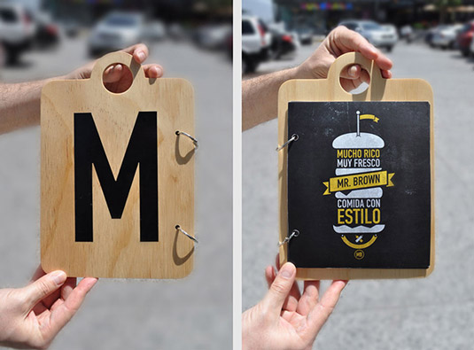
The design of this menu is simple yet impactful. The boards spell the name ‘Mr Brown’ and hang above the tables, rather than taking up valuable space.
Its wooden chopping board style and shape provides a natural nod to the careful preparation of their fresh dishes.
The chalkboard background of the menu also reflects on the relaxed atmosphere of the restaurant. No fuss, no frills, just good food.
7. Nozomi Sushi Bar, Spain
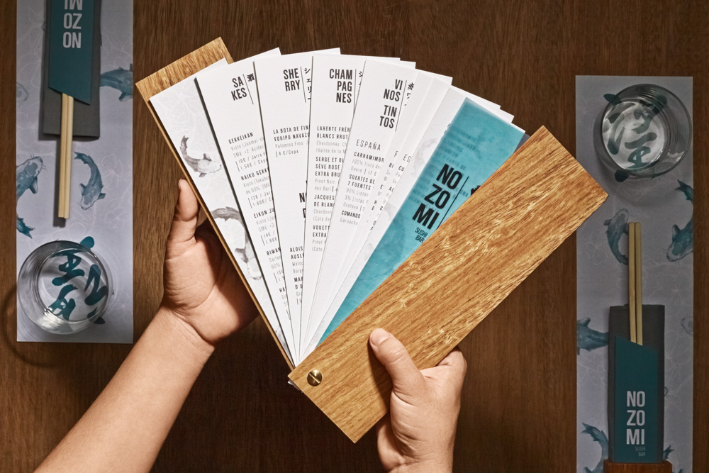
This menu choice celebrates the Nozomi Sushi Bar’s passion for Japanese culture, paying homage with a folding fan-style design.
It features blue Koi carp fishes – a Japanese symbol of luck. These are displayed throughout the restaurant’s branding – aligning the menu design with the overall style.
The menu design is playful too – folding out like a Japanese fan as the customer browses the different sections.
Finding menu design ideas near to you
We’ve gathered menus from around the world. but you can also find inspiration in the villages and towns close to you. We took to the streets of Southend-on-Sea to find our favourite local menu designs.
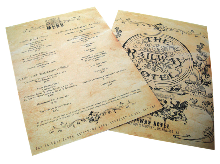
8. The Railway Hotel, Southend-on-Sea
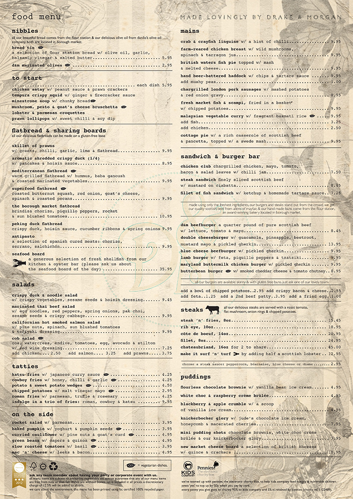
The shabby-chic design of this pub menu perfectly fits the Victorian building it resides in.
The parchment-style background is matched with authentic vintage text to convey exactly what you’d expect when you visit.
Its signature stamp features throughout the pub and the website, helping bring the brand to life by aligning their theme.
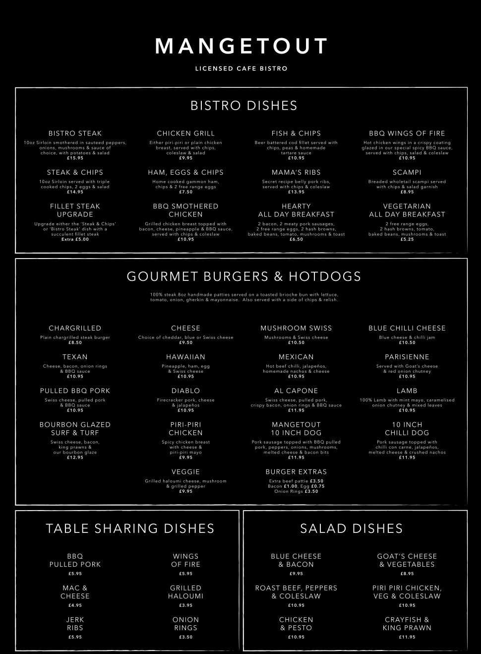
9. Mangetout, Southend-on-Sea
The menu design of this bistro is clean and minimal. Its functional layout is straight to the point and suggests an elegant but easy-going place to eat.
With this sleek, chalkboard black and white design customers can focus on what’s most important – the food.
Clearly laid out in boxes, the menu is separated into different parts, with bold and clear titles too. Ensuring your menu is readable is vital.
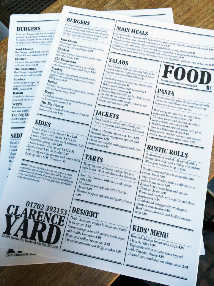
10. The Clarence Yard, Southend-on-Sea
The Clarence Yard presents its offerings as a fish and chip restaurant in a classic newspaper style.
The complete printed menu on a single sheet. But clever formatting means it’s easy to find your way around. Big headlines separate the different sections – and the grammar is on point.
You can even dial a takeaway from the menu – the telephone number is printed big and bold.

Great ideas for designs! I love the look of The Railway Hotel one, reminds me of the olden days of railway travel, can almost imagine ladies & gentlemen in all their finery! L’Encant version is a great idea, really innovative and different from the usual menu layout – brilliant!
Some really great menus,I especially like the Sketch one. it makes me want to go and find the restaurant for a parlour breakfast! Really inspiring.
Some really great and inspiring ideas here. I do enjoy designing our own flyers. It is the proof reading that I find challenging.
These are all great. I really like the Fade Street Social one.
Thanks for the inspiration. There’s some ace looking menus on here. Sometimes for a designer it can be a little difficult coming up with an idea to design a menu – the mass of text dictates the design. Personally I always try and aim for something like the Mangetout menu – the type is beautiful, everything is spaced nicely and is pretty much a designer’s dream (though some bits aren’t too legible in this example!) And how awesome is the L’encant menu?!
As a graphic Designer and food lover (trying to loose some weight though) i simply loved theses examples…ODD DOUBT: that “Clarence Yard” is “almost identical” to Byron Burger’s Menu…i don’t know if it was an homage or a “bald-faced copy”…or maybe they are from the same owner…or the same designer dealt with their menus…strange. On the positive side Mr Brown…Mexico with its innovative funny support and just loved also the astonishing and beautiful illustrations on The Pelican – Singapore and Fade street social – Dublin. Thanks for this post! awesome as the Solopress services and team.
Some of these are pretty cool – a place in central Manchester does comic book style reverses for their menus which are quite neat I think:
http://www.thekoffeepot.co.uk/cartoon-fun-by-our-very-own-lauren-beard/kp-menu-2013-back-2/
I think a restaurant’s menu sets the tone for the whole establishment, and I especially love the uniqueness of the designs for Mr Brown, Mexico and L’Encant, Spain. Very cool!