This week we’ve been looking at classic album art. Will what’s on the cover make or break your next music purchase? Let’s take a look at where the idea came from.
From the very first records sold in 1910 through to 1938, you would receive them in nothing more than a brown envelope-like sleeve bearing the name of the record company. At this time records were not something to browse and were sold in electrical stores, it was very much a case of knowing the recording you wished for and asking the salesperson for that.

For an industry which thrives on creativity, there was nothing else other than the music on the record itself to entice listeners. The initial leap came in the 1920’s when empty sleeves were bound into large, book-like ‘albums’ based on the concept of a photo album, again these card or leather bound covers would resemble hardback books far more than the albums of today.

In 1938, Columbia records hired Alex Steinweiss as the very first director of art, it is Steinweiss who is credited with the conception of the album cover as we know it today and by the later part of the 1940’s many major labels had followed suit with paper covers and original designs. The term ‘album’ was eventually used to describe the 12” LP (long playing) records which play at 331/3 RPM and by the 1950’s became the standard format for albums.
This concept allowed artists to express themselves with more than just the music and with the industry booming in the 1960’s artists were able to express themselves through their artwork as well as their music. A great movement for this was the rise of psychedelia in the mid-60’s producing elaborate album art such as The Beatles’ ‘Sgt. Peppers’, The Zombies ‘Odessey and Oracle’ and ‘The Psychedelic Sounds of The 13th Floor Elevators’.
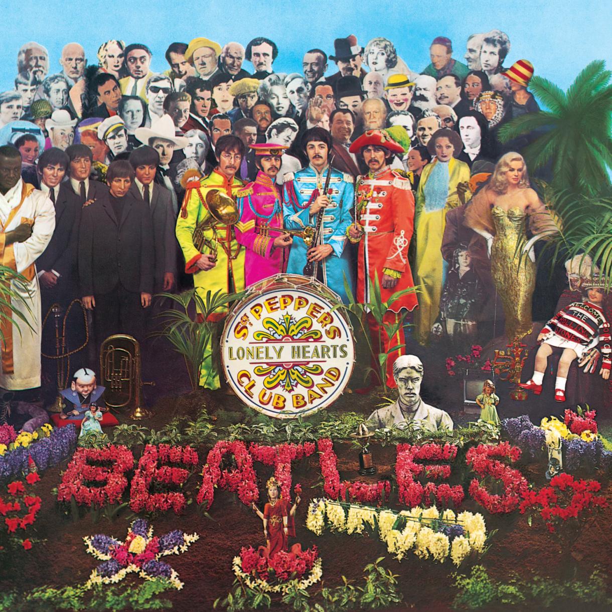
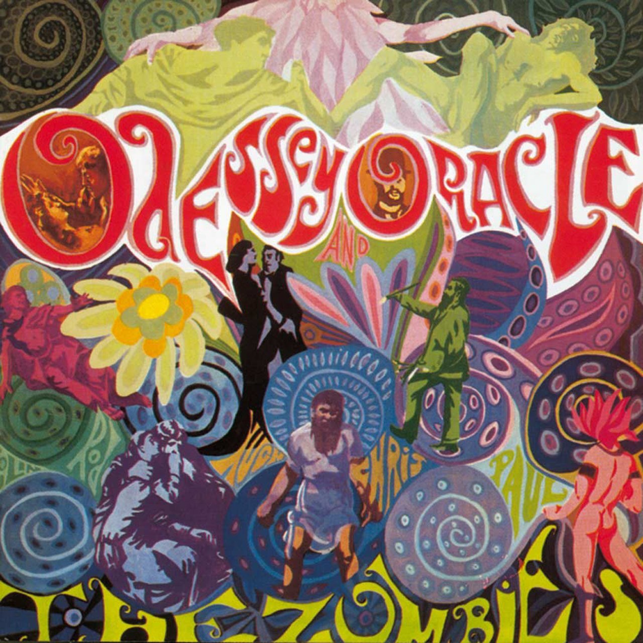
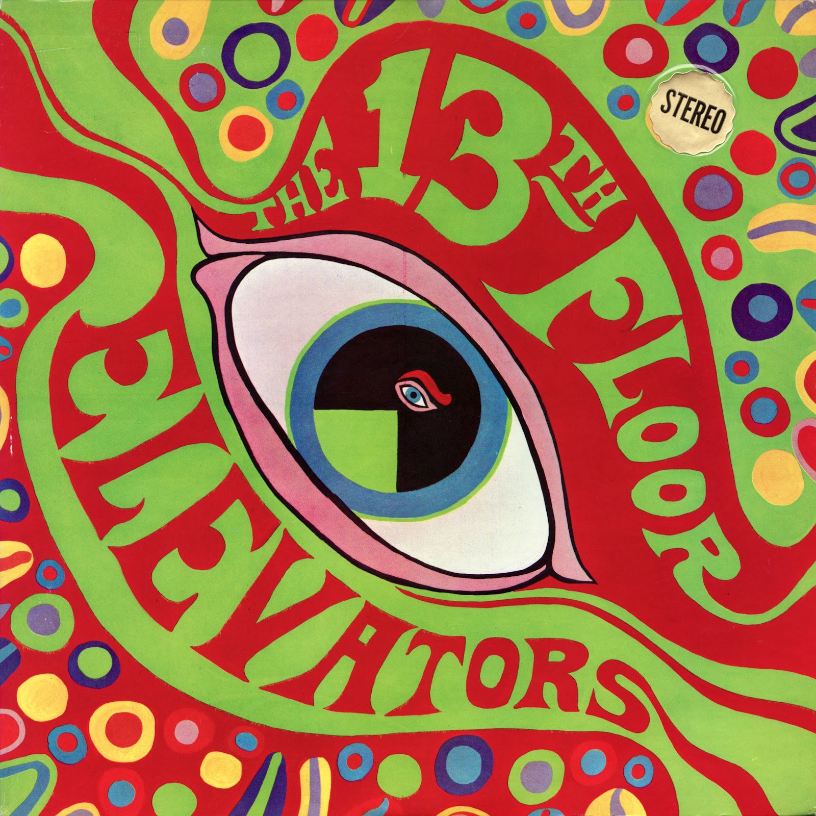
As the popularity of the compact disc rose and the LP took a deserved rest towards the late 80’s artists such as The Smiths began to define themselves through their use of photography on their covers, each one being far from the mainstream and giving an underground, murky vibe. In the same way, Radiohead have used illustration by Stanley Donwood as the cover for each album after their 1992 debut.
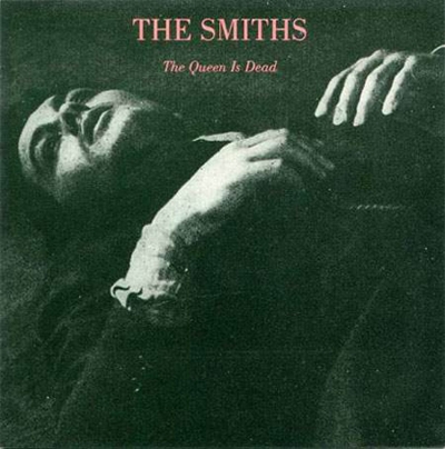
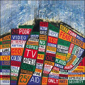
While many still follow the crowd in terms of album art and like to fit in with the rest on shelves; other bands use this space as a form of identity, The White Stripes managed this perfectly with their red, white and black covers for every album throughout their career.


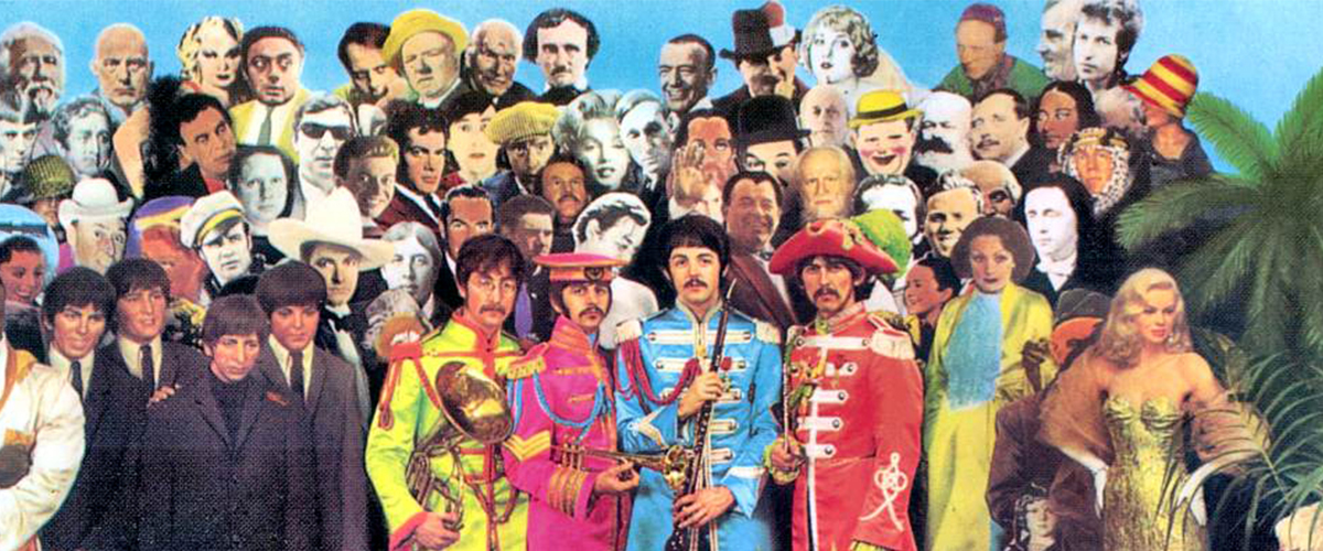


this was very helpful for me when I was doing my essay for Album Covers. It would be very helpful for me to ask you if you could add some more information so you can get more out of this section.