When designing a printed advertisement, the messaging is often the most important aspect.
However, no matter how persuasive it is, that message might be easily overlooked on a plain, white background.
That’s where colours can really have an impact.
They can draw eyes towards your ad, make customers feel different emotions and encourage them to interact with your brand.
We’re diving into basic colour theory in this guide, helping you understand what different colours mean and how to use them effectively in your advertising.
Colour theory basics
Colour theory is a combination of art and science. It includes rules and guidelines for using colour schemes to achieve impressive visual results.
The colour wheel
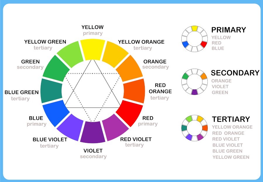
The cornerstone of colour theory is the colour wheel.
Fun fact, it was invented by Sir Isaac Newton in the 17th century after making several discoveries related to the colour spectrum.
The colour wheel consists of three colour categories:
- Primary
- Secondary
- Tertiary
The colours within these categories are then divided into two sections:
- Warm
- Cool
Warmer tones, such as reds, oranges and yellows are said to invoke energy when viewed by someone. While cooler shades, such as blues and purples, are considered soothing to the eye.
Using colours close to one another on the wheel will create what is known as colour harmonies. Whereas those on opposite ends are known as complementary colours and are good for creating contrasts in your design.
Primary, secondary and tertiary colours
In the standard colour wheel, the colours are divided into three groups. These are:
Primary colours – which cannot be created by mixing shades together:
- Red
- Yellow
- Blue
Secondary colours – made by mixing two of the primary colours together:
- Green
- Orange
- Purple
Tertiary colours – created by mixing one primary and one secondary together:
- Red & orange (Vermilion)
- Red & purple (Magenta)
- Yellow & green (Chartreuse)
- Yellow & orange (Amber)
- Blue & green (Teal)
- Blue & purple (Violet)
Colour models
Now, how does colour theory extend to digital and print designing?
Through two types of colour models that are most frequently used:
- RGB
- CMYK
The RGB colour model is the blend of red, green and blue to create other shades. It’s mainly used in digital designs, such as television adverts, mobile apps or webpages.
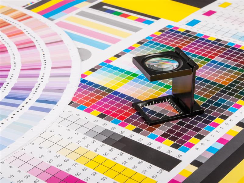
CMYK is the standard model for printed designs. It stands for Cyan, Magenta, Yellow and Black – the colours you’ll find on an ink cartridge. An exact balance of these tones will create the current shade for your printed materials.
We’ve got an in-depth blog on the print process for colours, check out our guide on Pantone vs CMYK.
What different colours mean
Each colour gives off a specific emotion when we see it in an advert, whether it’s a billboard, tv ad or printed poster.
Here’s a quick explanation about what they could mean for your print design:
- Red – if you want to make an impact, red is the way to go. This intensely hot colour represents everything from danger and war, to strength and power, as well as love and passion.
- Yellow – the brightest and most energetic of the warm tones, yellow depicts happiness, hope and optimism. Use in designs to create a friendly and welcoming mood.
- Blue – blue symbolises a mixture of emotions, from sadness to calmness and even duty and strength. Use lighter shades to convey relaxation and dark tones for reliability.
- Green – the colour of nature and growth, as well as wealth and consistency. Eco brands, new companies and growing enterprises can all use green to symbolise modernity and renewal.
- Orange – combining red’s fire and yellow’s energy, orange is the colour of productivity. It represents change, activity and encouragement – great for encouraging a customer to take action.
- Purple – traditionally, purple was the colour of royalty. Nowadays it’s used to show creativity, mystery and spirit. If you’re showing a new product or service, or changing your branding, purple is perfect.
How do brands use colours in advertising?
It’s said that colours increase brand awareness by 80%.
That’s why, when we think of a famous company, the first thing we see is their brand colours.
Businesses that understand the meaning behind colours and use them to their advantage are the ones we’re most likely to remember. After all, what’s McDonalds without its red and yellow signature logo? What would Coca-Cola represent in green packaging?
Beyond being recognised, the right balance of colours can also help you persuade, attract and appeal to your customers. This in turn can boost sales and improve the return you get on your investment.
Successful brands and their colours
Going back to the McDonalds example, the widely recognised yellow arches symbolise happiness. While the red background depicts desire and love.
Paired with the brand’s signature tagline ‘I’m lovin’ it’, these colours make you hungry for McDonald’s as soon as you see them.
The bright yellow arches are also easy to spot and the red signals you to stop – placing McDonald’s as a fast food haven, whatever time of day it is.
Blue is the most popular choice for brands, as its calm, strong tones help convey trust and confidence in that company. Tech companies, such as Samsung, Dell and Intel, as well as businesses from totally different sectors, like Solopress, Ikea and PayPal, all favour blue branding.
What sets them apart is the shades of blue they use. These different tones send messages to customers that are unique to that company.
For example, Facebook and LinkedIn use darker blues to show strength and reliability in their channels, which are popular platforms for businesses. While Twitter’s lighter, calmer tone better suits the everyday users looking for a place to write their thoughts.
How can you use colours in your marketing?

When it comes to establishing a brand identity, colours should be at the top of your priority list.
Here are a few helpful tips to master your use of colours in advertising:
- Do some market research – ask your staff and customers what word or feeling comes to mind when they picture your brand. This can give you an indication as to whether your advertising is hitting the mark or falling short.
- Brainstorm your brand – if your branding isn’t representing your company, it’s time for a refresh. Grab a blank sheet of paper, write your business’ name in the middle and start brainstorming what emotions you want to display.
- Pull your ideas together – look at the common themes between your research and your brainstorm and pull together the key emotions into a single plan. When you have everything in front of you, you’re ready to rethink your branding.
- Focus on two colours – match your goals against their associated colours and pick out two colours that best complement each other. Take care you don’t create mixes that may not work. For instance, strength and growth sound fine in principle, but in practice, green and blue are rarely seen side by side.
- Keep your marketing consistent – once you’ve chosen your key colours, keep it consistent across your marketing channels, to ensure your message is heard. For instance, a flyer or leaflet with your latest promotion should feature the same logo and backdrop as a Facebook post on a new store opening.
Ready to put your newfound colour theory into practice? Start printing your next batch of marketing materials by checking out our product range.


