UK Festival season is well underway as crowds flock to see the stars of the 2022 line-ups.
Glastonbury 2022 was reincarnated spectacularly, after a two-year hiatus.
In 2019, the UK festival scene was valued at a staggering £1.1 billion. The festival market in 2022, bolstered by a post-covid surge in demand and the prospect of a long hot summer, looks set to be another record-breaker.
We looked at the largest 10 British music festivals to crown who’s created the best Poster for the 2022 festival season.
The Bigger picture – UK festival attendances:
- Glastonbury – 210,000
- Download – 110,000
- Reading & Leeds – 90,000
- Isle of Wight – 90,000
- Creamfields North – 70,000 – South – 50,000
- Parklife – 80,000
- BoomTown – 76,000
- All Points East – 50,000
- Boardmasters – 50,000
- Wireless – 49,000
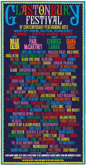
Glastonbury – Hit
Since 2015, Glastonbury has adapted a multi-coloured, more playful theme. Each poster since has presented a variation on that theme – the only thing that has been significantly tweaked and changed in this time are the names of the acts.
The fact that the style hasn’t changed in five festivals is a testament to its success as a design. After all, if it ain’t broke don’t fix it. All the headliners can clearly be seen from the top line and working down the list are the acts that will perform on other stages. The hierarchy is good and the use of coloured text works well.
The temptation for the first festival since the pandemic may have been to ring the changes in terms of poster design. In fact, it’s great to see the return of something as familiar. As we can see in 2022’s poster here, all the successful elements are present, with a tweaked border and the black background softened to a midnight blue. The fact that it’s recognisable from pre-pandemic designs reinforces the idea of a triumphant return to business as usual.
Download – Hit
An icy background design may seem contrary to the electric, fiery atmosphere that descends upon Donnington for this explosive, high-octane weekend. But the background creates a compelling counterpoint to the festival’s fierce energy and sets the event apart from anything else in the hard-rock calendar.
A snarling beast in the background forewarns any unsuspecting festival goers of the type of raucous music that’s in store for them in a weekend of mosh-pitting, head-banging fun. In the words of Paul Stanley, you can feel the amplifiers start to hum. In comparison to competing Posters, this design definitely helps Download stand out from the rest. Main acts are given bigger fonts while the three columns clearly show which day and stage artists will be playing.
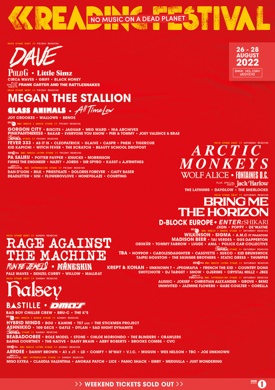
Reading & Leeds Festival – Miss
Straying from the instantly recognisable yellow backdrop, this poster doesn’t strike you as a Poster synonymous with the Reading and Leeds Festival. It’s refreshing that the R & L Festival deviated from their traditionally yellow Poster for a red design this year. A festival that has always used yellow with red has switched the dominance of its colour scheme this year.
However, the design leaves a lot to be desired. Given that the festival is seen as a right of passage for many youngsters, there is a conspicuous lack of vibrant, youthful elements in the design.
The unusual layout of the poster leaves a lot of empty space. It’s easy to see who’s headlining but you may require reading glasses to see the remaining acts! Important details such as the days that artists are playing and which stages they’re on could get lost at a distance.
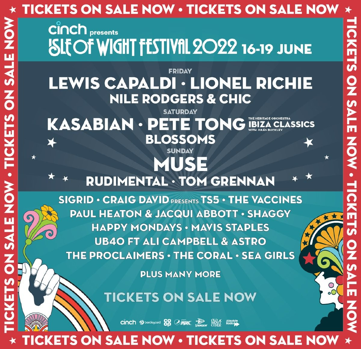
Isle of Wight – Hit
Those who shout the loudest aren’t always the strongest. Sometimes it’s easy to forget that simplicity is an unsung hero when it comes to good design. A light-blue backdrop gives the impression of a friendly, welcoming festival, which fits perfectly with this largely family-orientated weekend of fun.
The simple nature of the Isle of Wight 2022 Poster embodies the spirit of this chilled family-friendly festival filled with incredible acts. Although we must say, there won’t be anything chilled out come Saturday night when Kasabian headlines!
Possibly the cleanest typography to read out of all the posters, the bold font makes the weekend’s line-up easy to take in. Headline acts have been placed in a prominent position surrounded by a darker black, signalling that they’ll be playing long into the night. Acts below, are placed in a lighter blue to clearly point out the hierarchy of the festival.
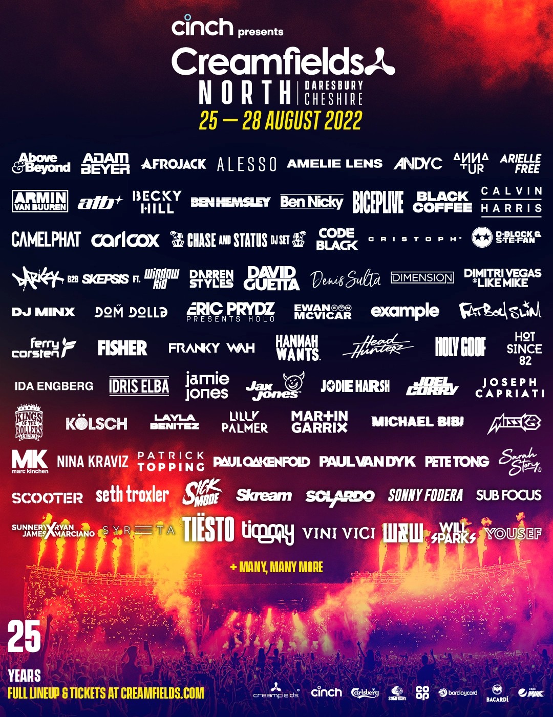
Creamfields – Hit
Celebrating its 25th birthday, the largest electronic music festival in the UK saw the introduction of its sister event, Creamfields South, based in Chelmsford, Essex. While it’s previously stuck to one Chesire location, this year deck-spinning icons from Carl Cox to Calvin Harris have the chance to play across two Creamfields events.
Reminiscent of an erupting volcano piercing a dark night sky, the Creamfields 2022 Poster strikes of the chaos likely to transcend the North of England at the end of August. Each artist can be clearly and since they’re written in the same sized fonts, it reflects how there are no traditional headline acts like most festivals.
The dark night sky shows the nocturnal side of this festival, where the music goes long into the night as Daresbury turns into Ibiza for four days.
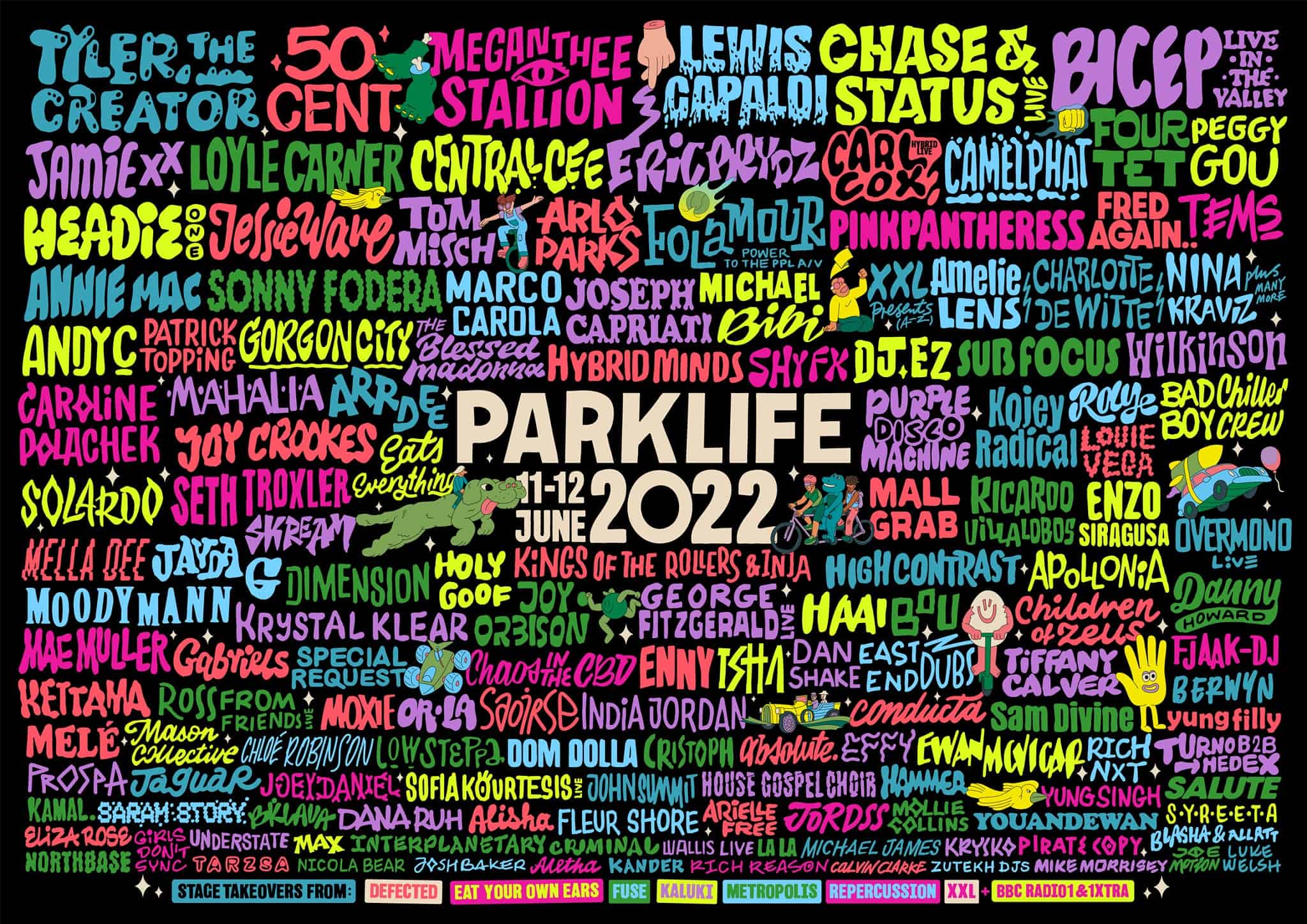
Parklife – Hit
Parklife 2022’s Poster is a loud and vibrant mix of all shapes and sizes, just like the artists playing. With a mix of the biggest artists from the rap, R&B and electronic scenes, this year’s Poster promises the biggest party this Manchester-based festival has thrown yet!
Having a variety of colours as large as the variety of artists on display, this Poster really supports the diversity that Parklife promotes and how it’s becoming a major player in the UK festival scene. Colourfully printed names upon the black backdrop suggest that the action at Heaton Park really kicks off when the lights go down. The brains behind Warehouse Project certainly know how to put on a party, but they’ve also made a great festival Poster.
BoomTown – Miss
Rather disappointingly, BoomTown has decided not to release a Poster for their 2022 line-up. This ever-growing festival has never been afraid to change the rules in a usually rigid industry and have been successful pioneers with previous innovations.
They announced: “The complex process of releasing a music line-up with exclusivity deals, billing and escalating costs have led us to decide that this is the time to rethink the way we approach it and explore new ways of doing things.”
While we’re disappointed there is no 2022 Poster, we eagerly anticipate the eventual line-up reveal, as well as the conclusion as to how successful this experiment has been.
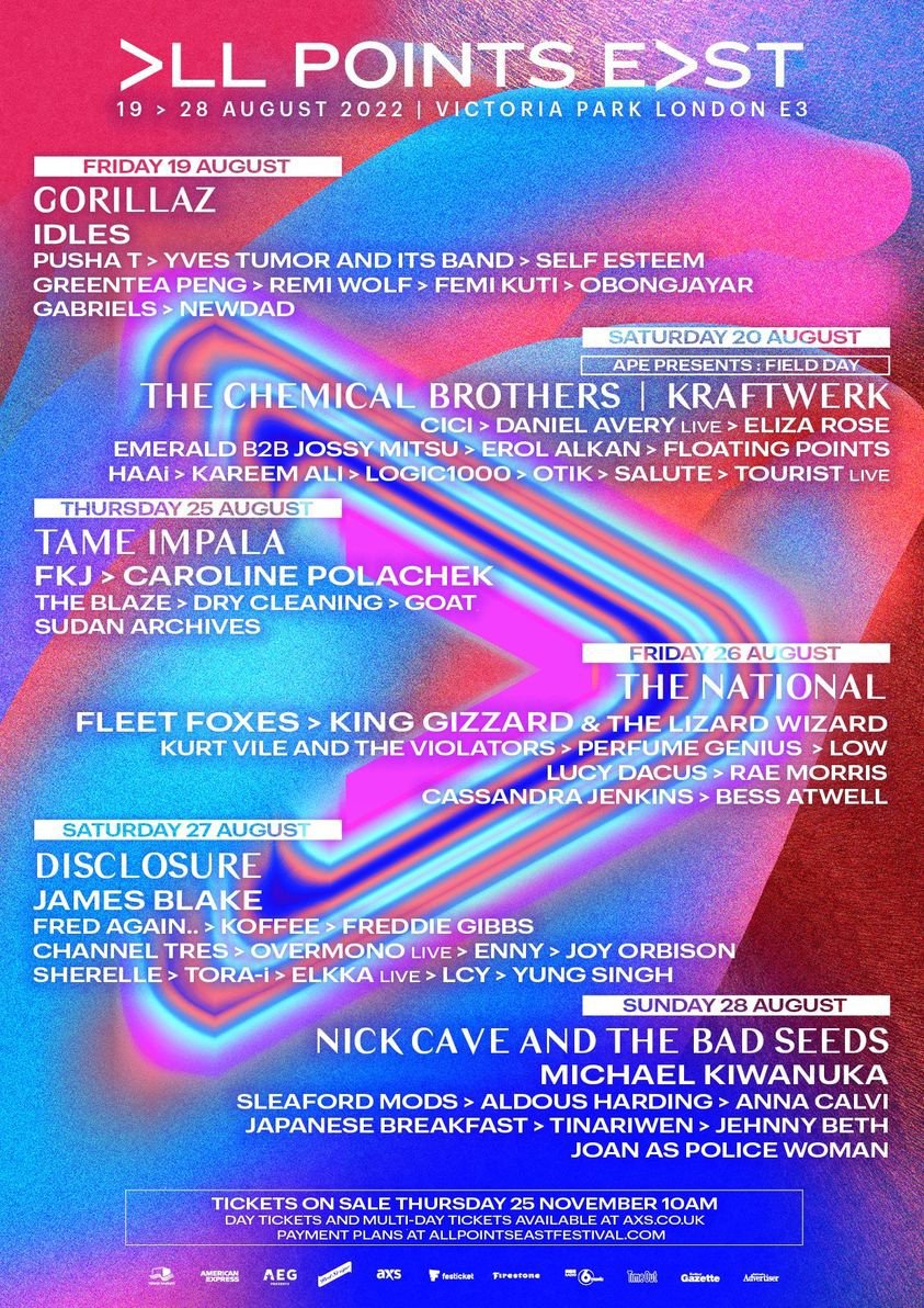
All Points East – Miss
This festival throws up something for every music lover to enjoy, during a week of one-day events held in the beautiful surroundings of Victoria Park. Just like the festival, there is a lot going on in this year’s Poster. For our money, this up-and-coming festival could certainly have benefitted from a simplified poster. Perhaps, the chaotic design was meant to epitomize the eclectic entertainment on offer at this festival. It’s all up to interpretation, which is the beauty of design!
White typography is difficult to read over the mix of a blue, pink and purple haze. There’s a lot to fit into one festival Poster, considering All Points East takes place from the 19th to the 28th of August, however, the design doesn’t feel over-crowded.
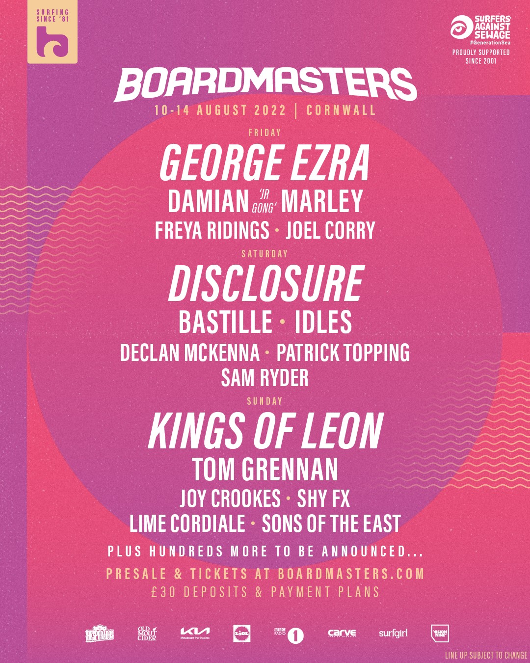
Boardmasters – Miss
A complete U-turn in comparison to the All Points East Poster design. Simplicity is key to this design, however, it’s arguably a very safe design for this stunning festival.
This beach and surf festival tips its hat to its history with the faintest of waves in the background of the Poster. Being such an iconic festival in the UK, recognised in particular for the beach and surf aspect, these elements could’ve been ingrained deeper into the Poster, as they are with the festival.
While the design itself is crisp, clean and aesthetically pleasing, it fails to encapsulate what makes Boardmasters more than just another Cornish beach party.
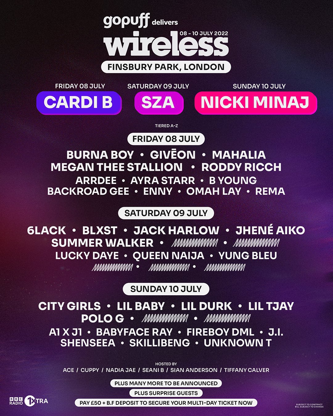
Wireless – Miss
London’s biggest R&B and rap-infused festival have chosen the simplistic route with its 2022 Poster design. Though we’ve championed design simplicity thus far, it could be argued the somewhat basic approach fails to capture what makes Wireless so unique. There are no pointers to the bouncing party that’s taking over Finsbury Park, anywhere in this design.
Coloured bubbles clearly indicate all headlining artists, and all other performers remain easy to read. This Poster definitely does its job, but arguably misses an opportunity to express its distinctive character as the top dog urban music event on the UK festival scene. While there may have been a lack of dynamism on the Poster, there definitely wasn’t anything lacklustre about the incendiary performances from Cardi B, Nicky Minaj and many more.
If you’re a fan of music with a bit of vintage motoring on the side, the largest VW campervan festival in the North East, with fun, food and activities for all the family might be more your cup of tea.


