Have you ever spent hours trying to figure out the best font style for your print work? Well here are some things you should be thinking about when choosing the ideal font style for your business!
Font Style
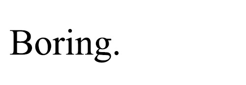
It’s important to think about what style of font might be most appropriate for your business. For example, if your business is known for being creative or innovative then it might be important to use an original font style to reflect this, rather than a standard font, such as Times New Roman. Unless you’re after a specific look, a serif font like Times New Roman most often just looks like, boring unformatted text.

Purpose
Consider your medium – what kind of literature are you designing and what is it’s purpose? If you are designing a poster for a one off event or to highlight a special offer, you may choose a bolder or more eye-catching font that you’d use for more formal literature such as letterheads. There is nothing wrong with mixing things up occasionally as this can be really eye-catching and generate interest, but if you use too many different fonts or styles for each item, the effect will be inconsistent and confused. Save the wild and wacky fonts for special occasions.

Don’t get carried away!
Avoid style over substance – it can be easy to get carried away with your font selection. We have often seen original font choices that are in fact illegible, so it is worth checking that you and your target audience will be able to read the document easily.

Low Resolution Issues
Consider how your font will translate onto the printed document. If you are printing a proof from a low resolution printer, subtle font characteristics such as delicate serifs or fine lines will not get printed, which means the final document may not look exactly as you were expecting.


I’d never thought of this before. Personally I love Calibri, though most popular fonts beside Comic Sans are usually good enough.
Found this post to be really insightful. Font really can make all the difference!
Yes, the wrong font can cheapen or deflate your message instantly. While some elegant slender ones give an air of sophistication in glossy magazine advertising. The same job an elegant slender model does for the clothes.
I hate fancy and small fonts, they make reading anything so annoying. Best to keep it simple and let the words on the page
shine through!
The one font that should be avoided at all cost (unless you’re doing something for primary svhool kids): comic sans
My favourite font is that of The Economist.
But the question is, how do we get a hold of it?
David
Hi David,
The Economist font was commissioned especially for the magazine. You may be able to get in contact with Monotype in order to purchase the font http://www.monotype.com or the alternative is to find a look-a-like such as Economist 101 http://www.fonts.com/font/monotype/the-economist-101
Hope this helps!
Very interesting thank you. I hadn’t really considered that Times New Roman might be classed as boring these days…. Solicitors the world over must be tearing out their hair!!
Very useful article – I suppose it’s obvious when you think about it but I wonder how many businesses use totally inappropriate fonts? An undertaker using Comic Sans might not be getting the calls!
I think a font can make all the difference to how your business is perceived.