Creating the branding for a gym, supplements company or similar business?
You may already have ideas in mind for the colours and overall style of design – but what about the typeface? If you’re seeking inspiration in choosing fonts for the health and fitness industry, look no further.
Font Examples
Realist
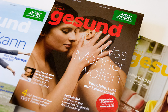
Featured in this example by German design agency WDV, this font is ideal for use in magazines featuring health and lifestyle subject matter. It’s Bleib Gesund, or “Stay Healthy” is a periodical from AOK of the German health insurance sector. Round, friendly and simple, it’s very readable without being boring.
Meran
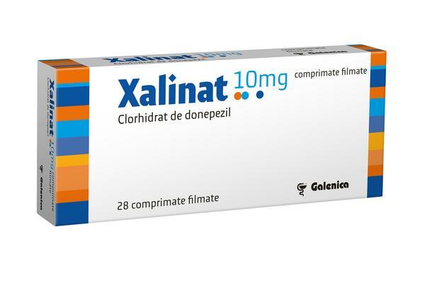
Factum Design from Romania used this font in their packaging design for Xalinat, a medication used to treat Alzheimers disease. Distinctly visible and memorable, it’s a font with high personality. When used in the health and fitness industry, this typeface conveys a sense of optimism and appears simple and honest – exactly what’s needed for a product of this nature.
FF Cocon
Used by California design agency Truf in their branding for Lela Buttery, a food and eco consultant, this typeface is creative and stylish. At the same time, it’s not ornate or complex and still looks fresh for use in the health and fitness industry.

Points To Consider
When selecting which are the most suitable fonts for the health and fitness industry, several key points should be kept in mind. While each one will possess unique styling, overall they should be bold, clean and confident. Fonts for gyms and fitness studios especially should pack and healthy, active “punch.” If you’re struggling to come up with a typeface or branding for a related business, you may want to start by aligning your design visually with those from major sporting or wellness brands – without copying their look, of course.
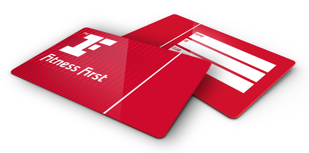
Don’t hesitate to use bold colours and make a statement, either, so long as the overall look is uncluttered. Remember, the health and fitness industry is all about personal progression and wellness, so any typeface you use should signal “improvement.” A prime example of this is the new branding and font for wellness chain Fitness First. Seen here on their membership cards, the look has been used consistently throughout everything branded by the company, from decorative wall logos within each facility to gym clothes purchased by their members.
The Solopress Advantage
If you’re designing the branding and marketing materials for a gym, vitamin company, aerobics studio or similar, we can help. Convey that sense of freshness and motivation you’ve developed perfectly with our wide range of print materials, including luxe triple layer business cards and cheap folded leaflets.

