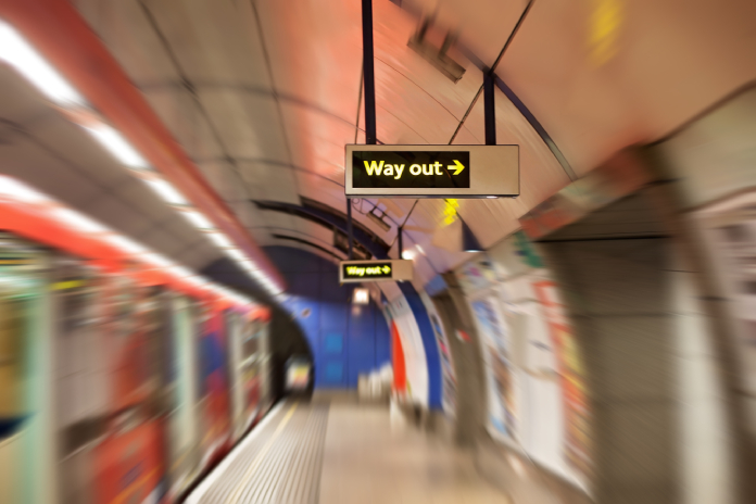
The P22 Johnston typeface is celebrating its 100th anniversary this year. Originally commissioned by the Commercial Manager of the Underground Electric Railways Company of London, now known as the London Underground, it was developed by and named after Edward Johnston, often referred to as the father of modern calligraphy.
Turning a century is, of course, worthy of a big celebration, and it inspired us at Solopress to share and discuss our typography knowledge in-house (or in other words, we had a fun font debate about it). During our conversations we asked ourselves:
What is the UK’s most recognised typeface?
This led to a few louder discussions, and with friendships suddenly on the line, we decided to get an official answer.
Using a survey, we asked 1,000 people a variety of font related questions and made the following revelations:
Arial is the nation’s most recognised font
Whether it’s due to it being one of the first fonts in a Microsoft Word dropdown list, or because of its homely look and appeal, one thing is clear, Arial is the UK’s most recognised typeface.
Our survey revealed 33% of people recognised it, and a further 55% selected it as their go-to typeface response for the remaining questions. This staggering association with Arial therefore, makes it worthy of the title of ‘most recognisable font’.
We also looked into Johnston (of course) and the Transport typeface – which is used across the country for most road signage. We were expecting a high acknowledgement for Transport, since it’s part of our everyday lives and practically everywhere, but a large 62% of people didn’t identify it correctly.
Only 23% of Londoners recognise the Johnston font
We discovered that only 23% of Londoners actually recognised the London Underground font. Overall few regions knew the font, with Scotland and Wales following London as the most likely regions to identify it. So hopefully, after the 100th year celebrations, recognition of this font will be on the up.
Considering how important this typeface is to the capital’s identity and that Transport for London states annual passenger numbers to be at 1.34 billion, we found the 23% stat to be surprisingly low.
In Times New Roman we trust
We didn’t just want to know about the most recognisable font though. Finding the nation’s most trusted font was also on the agenda.
Despite Times New Roman having the reputation of being for university coursework only, it was nevertheless chosen as the UK’s most trusted typeface. The trust we have in Times New Roman could be due to most academic journals using this typeface, or it could be due to a completely subconscious reason but, nevertheless, we as a nation have the most faith in Times New Roman..


I’m slightly confused with “but a large 62% of people didn’t identify it correctly.” when talking about Johnston font does this imply that 38% of people did correctly identify it and if so isn’t that more people than the 33% who identified Ariel.
Hi James,
The “62% of people didn’t identify it correctly” comment here refers to the Transport font, not Johnston. However, I agree that it’s ambiguous as to which is actually the most recognised. If we revisit this subject again in our blog, we’ll be sure to strive for a bit more clarity.
Apologies,
Solopress
Johnston Underground is not “used across the country for all road and motorway signage”, as you say.
The font used on most road signs in the UK is “Motorway”, designed by Jock Kinneir and Margaret Calvert at the Transport & Road Research Laboratory in the 50s.
Hi Kev, we did specify that “Transport” font is used on road signage, but wrongly wrote that it was also used on motorways which “Motorway” is used. Thanks for the heads up, we’ve edited the article to reflect this!