A targeted door drop campaign can be a powerful lead generation tool for businesses of all sizes. To make direct marketing simple for our customers, Solopress launched the Door-To-Door Leaflet Distribution service. The service allows businesses to upload artwork at Solopress.com and have it printed, packed and delivered, all in one easy transaction.
We were interested to learn about our customers’’ experience with the new service, so we followed early-adopter Farnham Chiropractic Wellness to see how they got on. In this first blog in the series, we get to know the business and take you through how we arrived at a leaflet design that’s specially optimised for a door drop campaign.
A chiropractor’s back–ground
Having trained as a chiropractor in South Africa, Grant Pretorius has been practising in the UK since 2008 and Farnham Chiropractic has been incorporated as a business for ten years.
The practice specialises chiropractic treatment, massage, physical training and nutritional advice. Having started out with a keen focus on the musculoskeletal system, Grant has developed a more holistic approach that looks at all aspects of wellness. He is especially concerned with how we can look after our health in a way that prevents recourse to medication or surgery.
Practice makes perfect
During his time as a practising chiropractor, Grant has become acutely aware of the importance of catching issues early before they develop into bigger problems.
An example Grant cites is organ failure. Sometimes the first time a patient becomes aware of a problem is when an organ fails, but an organ has to be pretty far one to stop functioning. If that deterioration could have been spotted sooner, the problem could have been treated through medical interventions or lifestyle changes.
Measure it, manage it
As a way to test and monitor health markers that determine how well our bodies are getting on, Grant introduced his ‘Wellness Score’ system. By quantifying certain aspects of a patient’s health and collating them into an aggregate Wellness Score, Grant was able to give them a snapshot of their health status. They can then use that score as a benchmark and progress from there.
While the Wellness Score has proved to be a successful tool, Grant was keen to go further. He became aware of how much more he and the patient could learn through a more involved battery of tests. This was especially true for the 40 to 60 age range, when many issues with the potential to impact later life first become detectable. This is how the Mid-life MOT came about.
The Mid-life MOT
Farnham Chiropractic Wellness’ Mid-life MOT includes medical evaluations that measure fitness, movement, musculoskeletal health, lifestyle and aspects of organ health as determined through a blood test. The resulting report Grant and his patients to identify any underlying health issues, flag up concerns for the future and to help develop a personal health plan to address the individual’s needs.
It is news about this service that Farnham Chiropractic really wants to get across to its prospective audience in the local area. A targeted door drop campaign employing a carefully designed Leaflet is a great way to get that message directly to the people that matter.
Creating a Leaflet
For his Leaflet, Grant wanted the design and language to appeal to the persona he had imagined. Such an audience might be time-poor, so it was important for the Leaflet to get the message across succinctly. The name of the service, Mid-life MOT, was devised to do just that. Once we read those words, we know precisely what’s on offer.
Existing assets
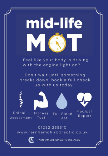
Before embarking on this direct marketing (or “DM”) campaign, Grant had already created a visual identity for the Mid-life MOT service, on top of the branding for Farnham Chiropractic and Wellness Centre, which includes a logo, house style and colour palette. Artwork assets for the Mid -Life MOT included some graphic icons that had featured on this existing design.
Not every campaign needs to start from scratch, and an existing, familiar style will help tie the new activity back to your brand. With company branding and a visual identity for the Mid-life MOT service already in place, these elements would form important content for the Leaflet design.
Putting it in writing
For the descriptive copy, the plan was to provide a good indication of what’s involved in the health check without going into the minutiae. The test itself is detailed and sophisticated, but for the door drop campaign, Grant was determined not to get bogged down in detail.
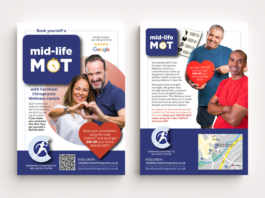
Instead, he chose to convey the information succinctly to his busy audience. An outline of the service with appealing language and a strong call to action formed the core of the content. In addition to describing the service, it was essential to include contact details. Alongside phone, email and address, we included a map of where to find the surgery and a QR code to take people directly to a dedicated landing page.
Whistl for help
Once a first draft of the artwork was complete, Whistl’s guidelines about what makes an effective Flyer came in handy. Whistl Doordrop Media is the third party provider that operates a service called LeafletDrop, which we use for door-to-door Leaflet distribution. Their vast experience around direct marketing has led them to produce a set of resources for marketers and designers that help them to create effective and engaging content.
With our first draft to work on, we turned to Whistl’s advice around imagery, layout and colour to make sure we were optimising our design. The main design pointers they recommend are:
- Include your CTA (call-to-action) on both sides of the leaflet
- Show ordering steps, ie. take the recipient through the purchasing process
- Make both sides of the leaflet impactful
- Share good reviews to display trustworthiness
- Include social media handles
- Include any special offers or discounts
- Circles work better than squares
- Portrait images work better than landscape
- Group images are better than individual ones
- Images of people making eye-contact are the most engaging
- Colour is better than black and white
- Warm colours are better than cold colours
Taking the tips onboard
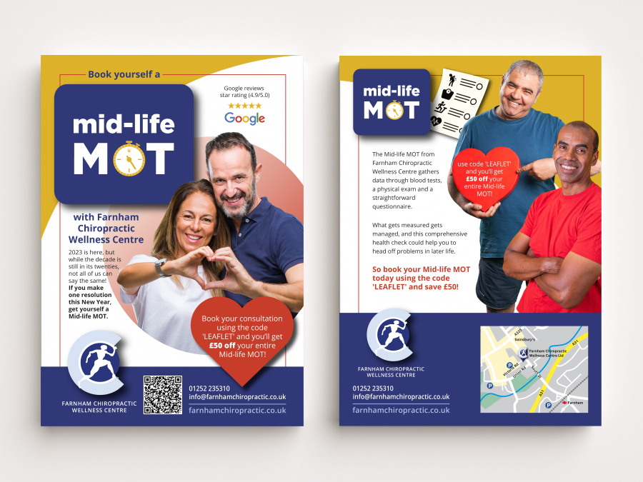
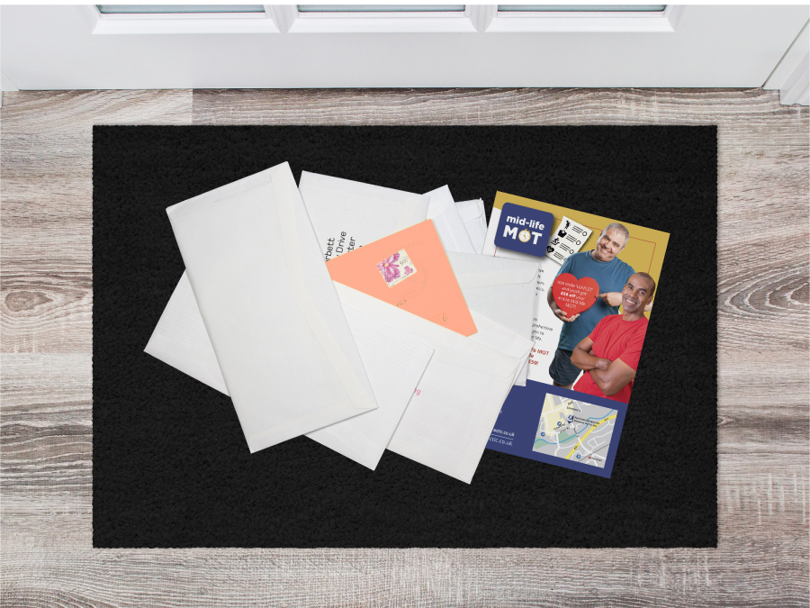
The tips that refer to both sides of the design are insightful. When you consider that a Flyer can land either way up on the doormat, it’s clear that both sides need to include some kind of visual hook to engage the recipient. Remember, for a particularly busy and sceptical recipient, you may only have the trip from doormat to recycling bin to plead your case!
In every respect, the list makes for a handy checklist to run through while finalising your design. We tried to hit every point with our final draft, although we didn’t feel social media details were a high enough priority in this particular campaign to claim valuable real estate on our design.
Eyes on the target
With a strong Leaflet design that ticks all the boxes, it’s time to look into targeting the right audience for the door drop. Look out for our next blog on Farnham Chiropractic and Wellness’ campaign, where we look at the ordering process, and how we can use insight into our prospective audience to pick the location, age, income and types of household that we’ll be targeting.


