Master the art of impactful posters and you’ll capture the imagination of passers-by. The key to a great design? A combination of effective images, intriguing colours and snappy text. Whether simple or complex, colourful or understated, if you get all the design variables right for your event or product, you can design a poster that makes your audience stop and take notice.
Posters should take your event or product, focus on its important aspects and advertise it in a way that’s appealing to the public. Creating such a poster relies on nailing seven key points:
- Colour
- Shape
- Paper type
- Size
- Illustrations
- Photography
- Fonts
We’ll guide you through all seven and offer tips to help give you poster design ideas for your next big event or sale.
Customisable poster ideas
Colour
Different colours evoke different emotions. Bright shades such as red, orange and yellow portray excitement and vibrancy, while monochrome colours represent calmness and simplicity. Whatever you’re advertising, choose your colours according to what you want your audience to feel. Use them to bring attention to your poster and highlight important pieces of information or as an eye-catching background.
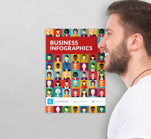
Design tip: If you’re advertising a new product or upcoming event, use brighter colours to grab attention and build anticipation.
Shape
The shape of your poster is usually determined by what you’re promoting. If you’re advertising a gig or a one-off event, portrait posters are ideal as they’re likely to be text-heavy. Conversely, landscape posters generally suit photography-based designs.
Be conscious of where you’re placing your poster when picking a size. If you’re advertising in a shop window, a smaller, portrait-style is better suited.
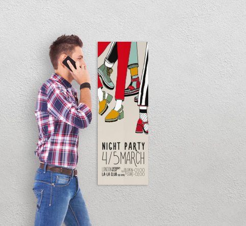
Design tip: Want to create something unique? Our strip posters are portrait-style but with extra room to work with. They’re available in A3, A2 and A1 sizes.
Paper type
Your choice of paper can say a lot about what you’re promoting. The key is to match your paper type not just your budget, but also your subject. For prestigious events or products, a glossy finish to your poster can exude quality. If you’re advertising an independent, underground event, try a pulp paper type to give your poster a raw effect.
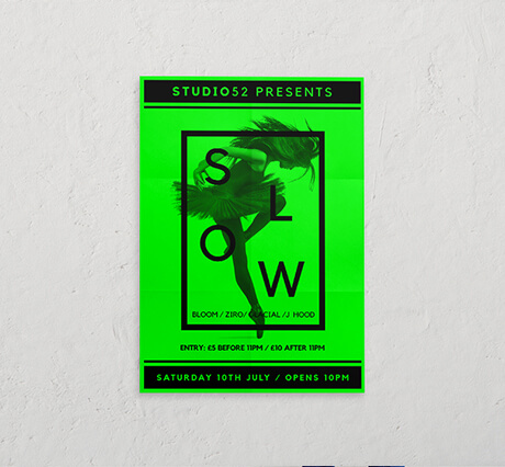
Design tip: Try Day Glo poster paper and add a fluorescent effect to your design. It’s perfect for placement on streets or inside restaurants or bars.
Size
Determining your poster size depends on where it’s going to be located. If you’re planning on placing your poster indoors, it’s best to choose a smaller size to cope with the space you have for it. Larger posters, such as our B-series sizes, usually have the most impact on audiences because of their size alone. Plus, you have more space to work with.
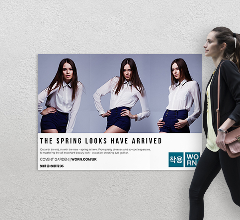
Design tip: If you’re struggling to decide what poster size is perfect for your promotion, we have several templates available for you to download. This way you can check if your artwork will suit a particular sized-space.
Illustrations
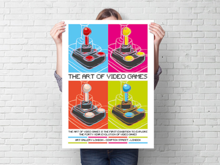
Using original artwork on a poster is a creative way to advertise an event or product. It allows you to mix illustrations with vibrant colours to capture the imagination of the public.
Whenever you’re creating illustrations, be conscious of the placement and allow room for text – it’s worth knowing your poster size beforehand so you know how much room you have to work with.
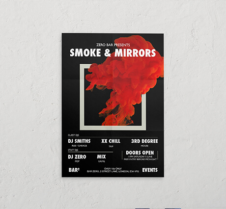
Design tip: Promoting an exhibition? Try representing the style of your event using unique illustrations that follow the theme.
Photography
Commonly seen on film and lifestyle posters, photography tells you everything you need to know about an event. Utilising the right camera-shot, with accompanying text and printed on the correct paper, can grasp the attention of passers-by.
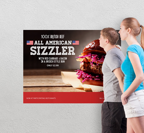
Design tip: When using a photograph as the background for your poster, try a minimalist design with only the essential text to allow the photograph to be the centrepiece.
Fonts
When deciding what font best fits your poster, you need to ensure that it’s readable from a distance. To draw someone’s attention, opt for a bold font in a large size, including all the important details about your event and product. That way you’re commanding their attention with a headline.
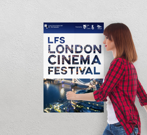
Design tip: Play around with different fonts and see what works. A mix of styles, usually from the same font family, adds interest and helps keep the viewer’s eyes on your poster for longer.
Inspired by our poster ideas? At Solopress, we can make your dream design a reality. We have a huge range of poster printing sizes, finishes, paper types and much more. Whatever you’re advertising, we can help you create attention-grabbing designs.

