Design accessibility is a big issue. Millions of people in the UK experience problems reading printed materials, such as posters and leaflets.
But many firms are ignoring the issue of designing for accessibility. Our recent survey found 56% of businesses fail to consider accessibility needs related to conditions such as dyslexia, colour blindness and early dementia. Many businesses are creating printed materials that deliver information in a way that many people cannot understand.
At Solopress we want to change that. We’ve created a set of accessible design templates that will help you create printed materials that can be read and understood by more people.
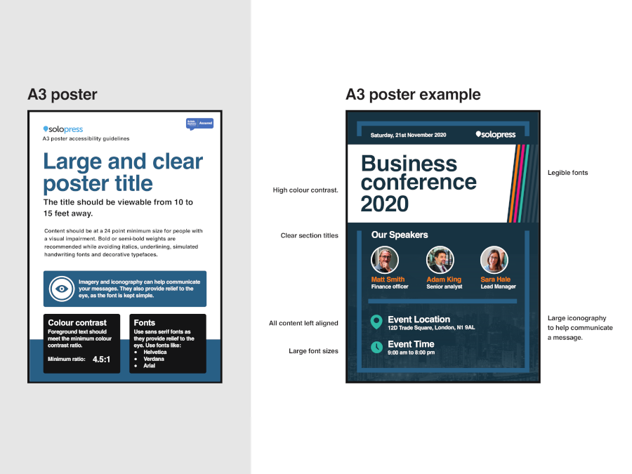
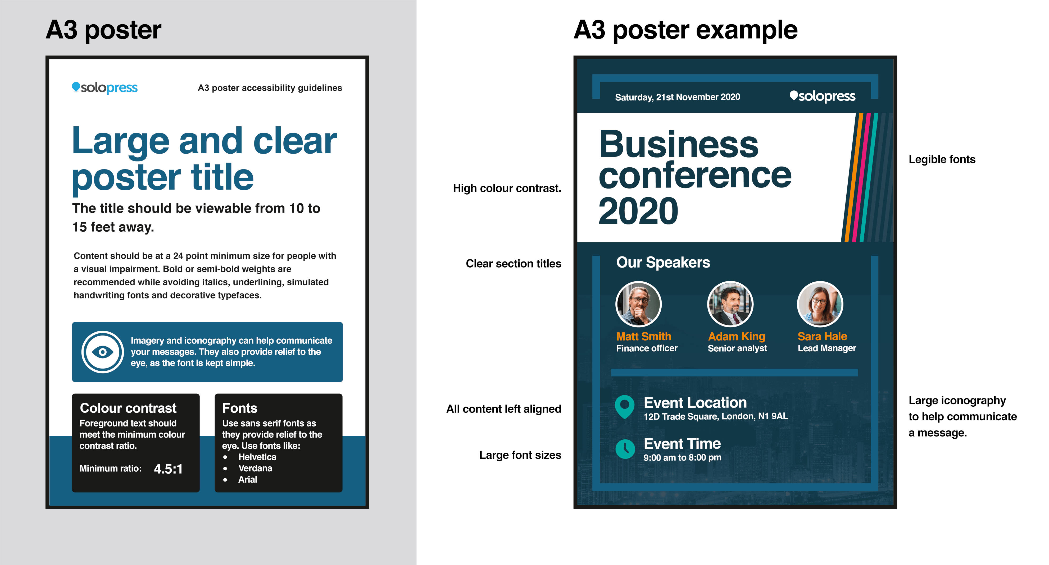
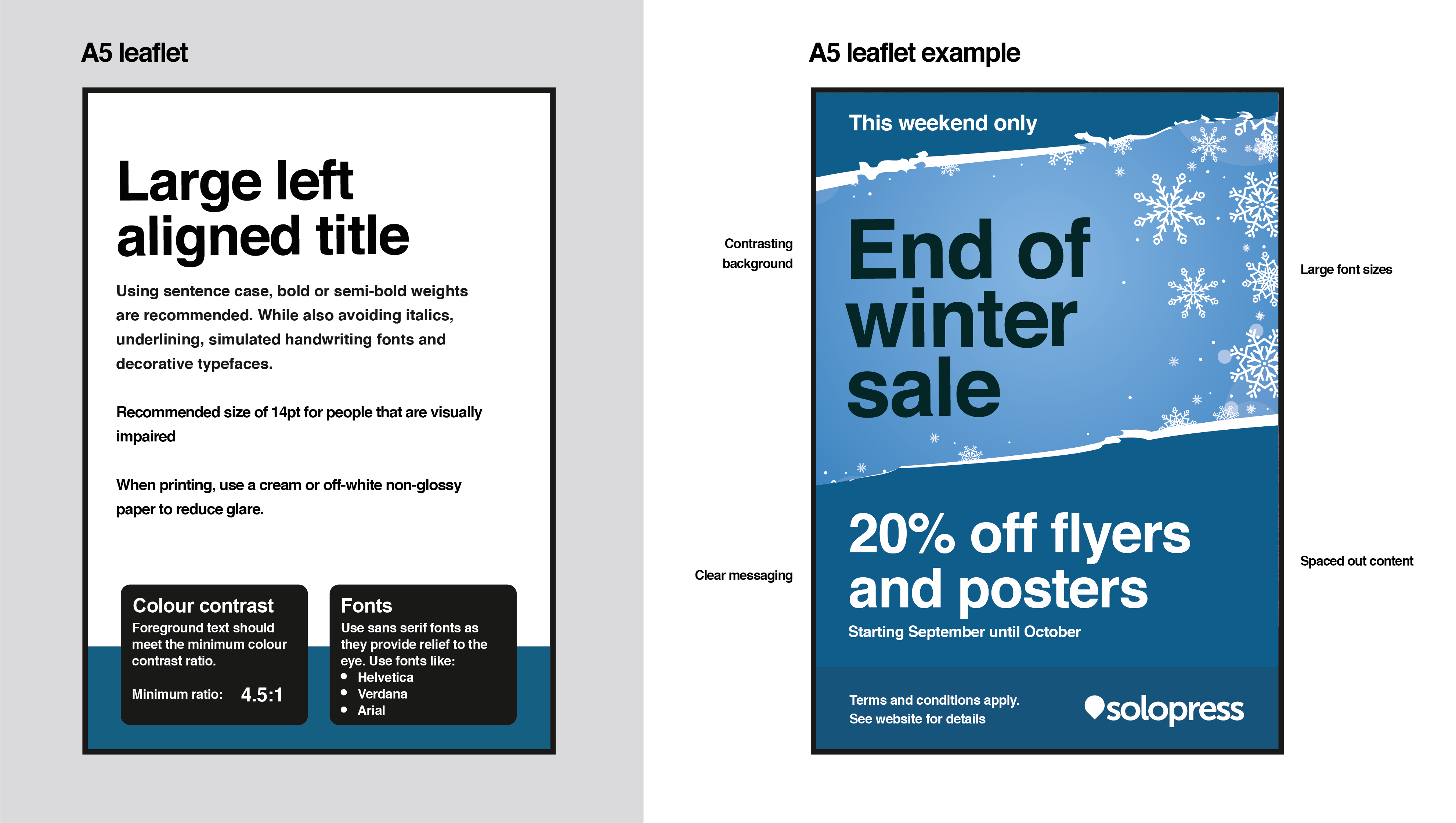
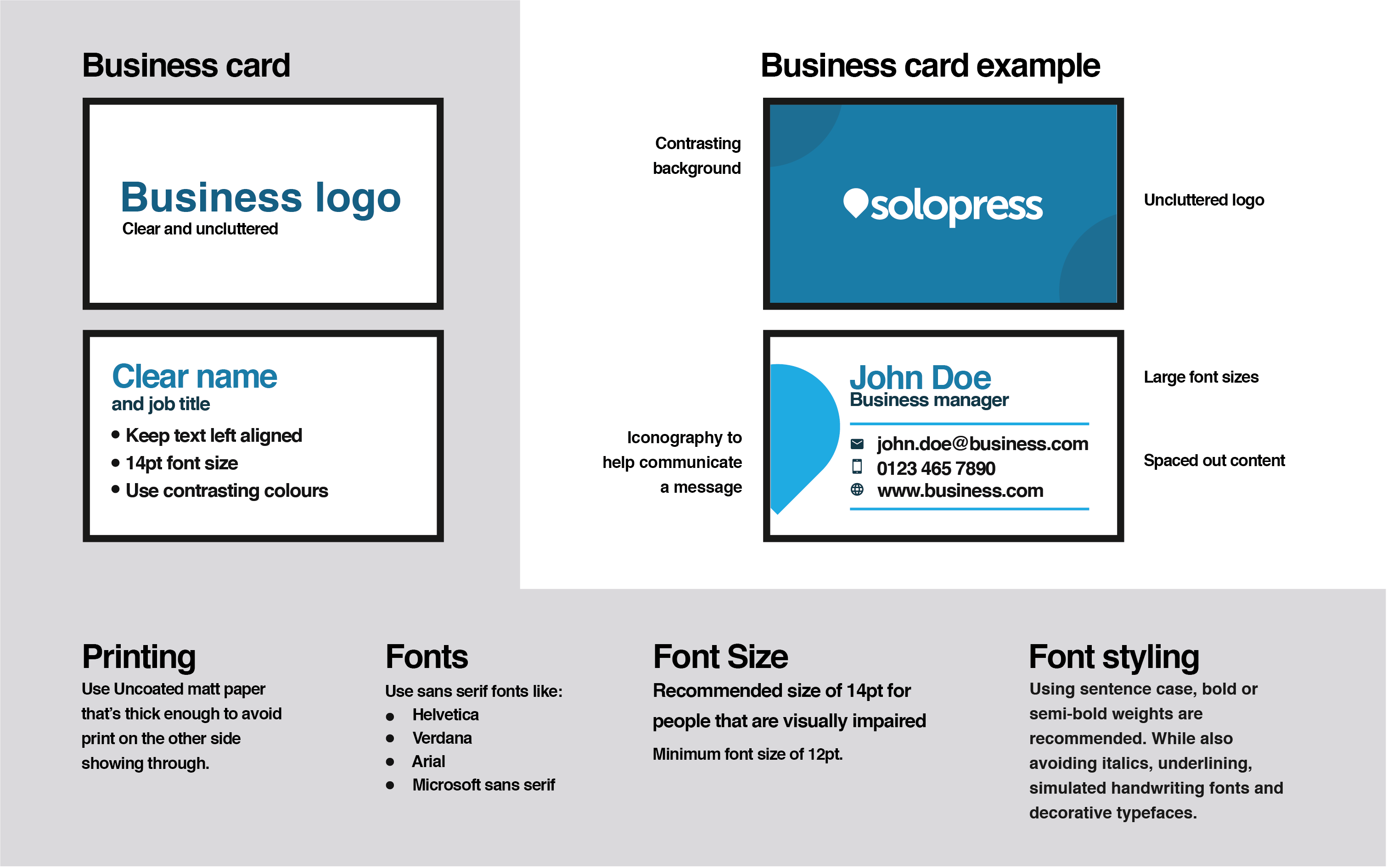
We created these templates:
Our templates have been added to the Assured Classification by the British Dyslexia Association, in recognition of their accessibility for people with dyslexia. Learn how we created the templates.
Helen Boden, CEO, British Dyslexia Association, said: “These designs are part of our Assured scheme, showing they will work for people with dyslexia. We hope people using them will see that dyslexia-friendly design is simple and makes content easier to engage with for everyone.”
What is accessible design?
Printed materials that are said to have “accessible design” are those created using colours, fonts and layouts that can be read by a much broader audience. This particularly includes those living with:
- Dyslexia – an estimated 6.6 million people in the UK live with varying severities of dyslexia, according to the NHS.
- Colour blindness – 3 million people are colour blind in the UK.
- Visual impairments – 2 million people are living with visual impairments which affect their day-to-day life.
- Early dementia – 850,000 people in the UK are currently living with dementia.
- Related disorders (ADHD/memory issues)
- Basic literacy issues – an estimated 8.7 million people in the UK have basic literary issues.
Designing for accessibility – tips and challenges
When designing our templates, we learned some valuable lessons. Here are the top tips to follow when creating accessible design.
Use visual hierarchies for layout
Visual hierarchies are an excellent way to guide your reader through the poster or pamphlet. On our A3 poster template, we recommend a clear title, in a large font, which should be viewable from 15 feet. The remaining text should be in a smaller font – no less that 24pt. For a leaflet or brochure, a smaller font of around 14pt is correct for body copy. Clear and descriptive headings explain the content that can be found in each section.
Structure content for the scan reader
- All content should be left-aligned, according to guidelines from the Government. This gives you ‘maximum legibility’.
- The messaging should be front-loaded with the most important words.
- Content should be well spaced and able to breathe – use short paragraphs with white space between them to avoid blocks of text.
- Ensure fonts are clear and legible. Favour sans serif fonts and avoid italics.
- Use bullet points to break down key features or a step-by-step process.
- Put black text on white background to ensure readability.
Write in simple, plain English
The content – the actual words on the poster – are as important as the design. We call this content design. Writing in simple plain English is one of the easiest ways to boost your poster’s accessibility. Favour short words over long words and use simple words instead of complex ones. Don’t overload your sentences – Government accessibility guidelines recommend 10 to 15 words per sentence. Remove unnecessary words or empty phrases from your copy. Explain jargon in a way that makes it relevant to the reader. Remember that the average reading age in the UK is around 11 years old.
What challenges did we face?
When we began designing our accessibility templates, we encountered several challenges. Here’s how we used creative thinking to overcome them.
Placing text and dealing with empty space
We wanted to follow the Government and British Dyslexia Association guidelines to create left-aligned text. We realised this could cause issues around layout, with excess blank space and alignment with images potential problems.
Empty space on the right-hand side of the design can be filled with graphics or imagery. This can add flourish to a poster, provided it doesn’t interfere with the readability of the text.
Brand colours and colour contrast ratio
How one colour looks against another is called contrast – and there are minimum standards for colour contrast when designing for accessibility. 4.5:1 is the minimal contrast ratio as set by the Web Content Accessibility Guidelines. This ensures text can be seen against its background.
This can be difficult when working with brand colours. Restrict the use of brand colours that don’t meet the contrast ratio to illustrative graphics not related to the copy. For instance, in our business card template, we’ve recommended you add accompanying graphics at the side of a card to fill empty space and use recognisable brand colours and icons.
Finding the right fonts when limited to sans serif
Sans serif fonts, those without extending features, are among the most readable for those with dyslexia, according to the BDA, as they have a less-crowded layout. Government guidelines also advise you to favour an ‘simple font that spaces letters out’. We advise you to favour sans serif fonts such as:
- Helvetica
- Verdana
- Arial
Serifs are the additional lines or curves added to the main body of a letter. Being restricted to sans serif fonts shouldn’t stunt your creativity. Adding design flourishes to areas that don’t include text can enhance a simple font – without impacting on its readability.
What resources did we use?
To create the templates, we combined our own knowledge and experience with the latest best practice guidance on design accessibility from trusted sources, such as the British Dyslexia Association (BDA) and Government guidelines on creating accessible print publications.
The British Dyslexia Association is a UK organisation that provides a platform for people with dyslexia. It has created a dyslexia friendly style guide which clearly outlines the design techniques to create printed materials readable for people with dyslexia. We also used guidelines from the Sensory Trust – which aims to make places more accessible.
Key accessibility design takeaways
- Focus on the user. The best design is user-centred. That means before you start creating, you spend time understanding your audience and the challenges they face. User-centred content identifies the information people need to get from your design and makes it the main focus. Think about what they need and design it from their standpoint.
- Keep it simple. Don’t overcomplicate things. Use easy-to-read sans serif fonts to frame clear and unmistakable messages. Write in plain English and present things with clear visual hierarchies. Don’t be afraid of white space – and use graphics and illustrations to help fill these gaps.
Start designing for accessibility with Solopress. Our posters can be customised with easy-to-read text and artwork to make them suitable for a broader audience.
Design your accessible printed materials using our design templates.

