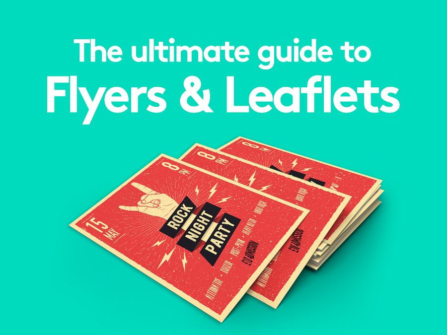
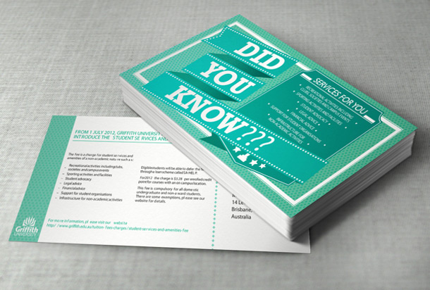
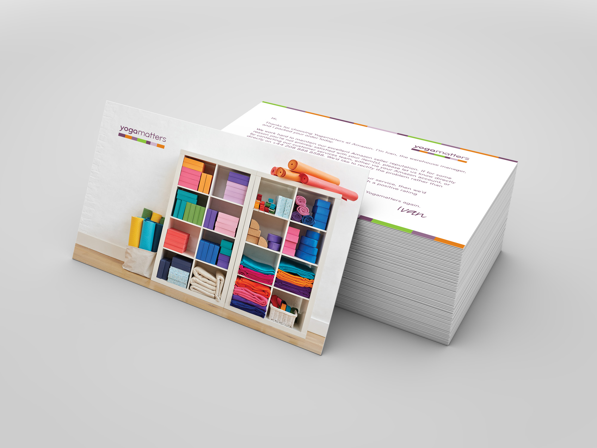
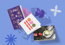
Flyers and leaflets are an affordable way to promote events, products and services – putting your message in front of a large audience.
If they’re well designed, they’re likely to be kept by your recipients too. 45% of people who receive them are likely to pin one on their noticeboard, according to a DMA study.
Distribute them in the best places, to the right people, and they can become one of the most effective parts of your marketing strategy.
To help you master the entire process, we’ve created this complete guide for writing, designing, printing and distributing your flyers and leaflets.
What’s in this article?
- What are the benefits of flyers and leaflets?
- How to write a leaflet or flyer
- How to design a leaflet or flyer that stands out
- What flyer or leaflet designs could I use?
- What’s a good size for a flyer or leaflet?
- What’s the right type of paper for flyers and leaflets?
- How to distribute flyers and leaflets
What are the benefits of flyers and leaflets?
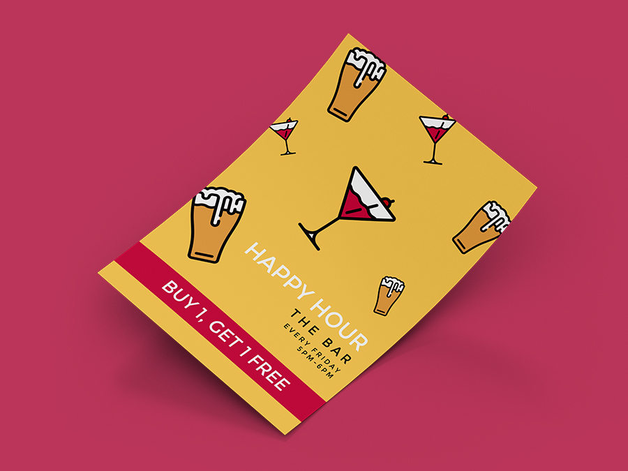
The reasons businesses print flyers and leaflets are simple – to spread awareness, drive sales, attendance or simply to communicate information.
But what makes flyers and leaflets such an effective way of doing this?
We examine these benefits in our blog revealing the advantages of leaflets. In brief, those points are:
Events promotion
What gives flyers and leaflets the edge when advertising an event, is that there’s already a strong tradition of using them as a way to promote.
Your audience will already be expecting to see them being handed or posted out, especially if there’s a big upcoming event they’re thinking about attending.
Frame your key messages
A flyer or leaflet is a neat space for encapsulating your message. If it’s more substantial than a slogan, but doesn’t require a multi-page brochure, you can summarise it in a flyer or leaflet.
That could be:
- Core values
- USPs
- Discounts
- Event info
In fact, they can get across pretty much any message that you want your audience to receive and, quite literally, take away with them.
Great return on investment
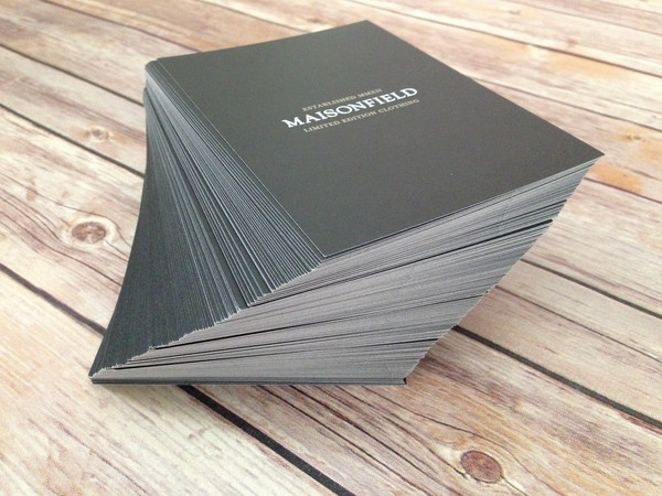
The unit cost for flyers and leaflets is mere pennies, so the outlay, and therefore the risk, is small. They’re one of the cheapest ad streams, especially now that digital marketing is becoming increasingly difficult to penetrate without investing a significant budget.
Eye-catching folding styles
Putting flyers to one side for a moment, folded leaflets are a great way to produce a multi-page document out of a single, double-sided, printed sheet.
You don’t have to settle for a simple 4-page half-fold either. There are a whole host of options to pick from including:
- Z-fold
- Gate-fold
- Map-fold
There are plenty more to choose from too. Discover what other styles are available in our folded leaflet type guide.
Create tailored, on-brand designs
A flyer or leaflet lets you communicate your essential info and still have just enough room to let loose your design skills.
That creative element can be harnessed to produce a piece that they’ll want to keep and display. That will let your flyer or leaflet to keep on telling your story for as long as the recipient keeps hold of it.
Put them in front of your target audience
You’ll probably know your audience well and flyers and leaflets are perfect for targeting them. That’s because they can be handed out in specific places where they are likely to congregate and at particular times.
That might mean Saturday morning high-street shoppers or Saturday night gig-goers. Either way, flyers and leaflets let you zone in on the areas and people you want to get your message across to.
Creative expression
Forget the audience for a moment, what about you? If you’re passionate about what you do, it’s sure to be an expression of your personality.
If you’re a photographer, artist or writer, leaflets and flyers allow you to showcase your creativity and advertise what you do.
People still trust print
There’s just something about the support of high-quality printed material that lends legitimacy to a message.
That’s not just a hunch, it’s the findings of an international survey of over 10,000 people, which found people are more likely to trust printed info, as opposed to digital.
Trust is an important step towards a conversion and printed flyers and leaflets help to demonstrate that you’re running a credible operation.
Build relationships
Sometimes your engagement with your sales prospects can be brief. You might not be able to close a sale there and then.
Having a flyer or leaflet in your toolkit gives you an opportunity to extend that engagement and strengthen the relationship you build with your audience.
If you’ve done a brilliant job of designing an engaging flyer or leaflet, it can close the sale for you at a later date.
How to write a leaflet or flyer
Before design comes content. Your flyer or leaflet needs the important information you want to get across to your recipients in order for them to buy, attend or use whatever you are promoting.
Here’s our roundup of the key points to remember while composing content that turns readers into paying customers.
1. Establish your own tone of voice
Tone of voice can be summarised as the personality that a brand creates through the language they use.
Successful brands tend to control their tone of voice very closely, to ensure they’re always presenting a consistent persona.
If you haven’t already, consider the individuals that make up your audience. What language do they use? What language will they respond to?
Harness this language across every aspect of your marketing, and make sure your flyers and leaflets follow suit.
2. Create eye-catching headlines
Hurry. You don’t have much time. Grasp your audience’s attention with an attractive, relevant, and benefit-led opening line.
Dangle that benefit in front of the reader and make them believe they have something to gain from reading on.
Use your customer insights, or conduct market research, to find out what they value and create content that is appealing.
They might value low prices, speed or quality. It might be important to them that you’re trustworthy, ethical and eco-conscious. Or, they may have a frustration that your business can solve.
3. Use language that sells
Be personal, yet universal. Address your target customers, but avoid language that may exclude entire sections of your audience.
Choose words that appeal to their emotions. Identify their pain points and position yourself as the solution. Evoking certain feelings can have a powerful effect on your audience and prompt them to gravitate towards your brand.
And when you do come to offer them the solution, consider urgent and engaging language like “exclusive”, “free”, “bargain” or “earn”.
4. Focus on the USPs
What’s your unique selling point? If you’re truly offering something that none of your competitors can, then it’s got to be worth shouting about.
Let your audience know that you can provide them with something new, or a better product or service than your competitors can.
Use these USPs as the basis to build your flyers and leaflets around, making sure you spell out the real-world benefits to the reader.
5. Get straight to the point
Keep your message succinct. Make sure your tone of voice is consistent with your brand while expressing your message clearly and speaking to the customer directly.
Don’t overwhelm your reader with long blocks of text. Break up paragraphs with sub-headings and use bullet points to list key information.
Above all, use plain English. Remember, the average reading age in the UK is nine years old, and a confused customer tends not to buy.
6. Include key details
These are the essential pieces of information that most flyers shouldn’t be without:
- A benefit-led, eye-catching headline –grab recipients’ attention and try to appeal to a need you can fulfil with your headline.
- Branding – make it clear from the look and feel that your leaflet or flyer represents your company and its values.
- USPs – get across how you’re unique with facts to support why your service or event is worth their custom.
- Offer details – price might be one of your USPs, but if you’re running a sale campaign, include discounts, voucher codes and T’s & C’s.
- Essential information – company contact details, event times and dates, location, prices etc.
- Call to action – it’s important to leave your reader in no doubt as to what they need to do next. Be as clear and direct as possible with opening phrases like: “visit us at…”, “discover more by…” and “explore our range at…”.
How to design a leaflet or flyer that stands out
A creative and well-designed flyer or leaflet can help your brand stand out against competitors. It needs a strong design that’s professional, effective, readable and engaging. We’re answering a few common questions about this process to help you get started.
How do you make a flyer or leaflet look professional?
Don’t overload the space with information.
Pick out up to three messages you want the reader to take away. Focus on laying these out in a format that can be understood at a glance and is uncluttered.
If you aren’t used to designing marketing materials, using a professional designer is a wise investment. An experienced graphic designer will know what works and how to incorporate your existing branding with your latest message.
How do you design an effective flyer?
A quick glance at a flyer or leaflet can set the tone for your company, so you’ll want to make sure your artwork is distinctive. It should say something about who you are and what you do.
Make sure your colours, proportions, layout and fonts are all consistent with the way you brand yourself elsewhere in print and online.
If you’re stuck on how to make leaflets or flyers that align with your branding, you can speak to our team of in-house designers who’ll help you create a final product that perfectly suits your company.
What is the best font for leaflets?
Sans serif fonts are a strong choice for flyers and leaflets for their clean entry points and strong legibility.
Helvetica is a good choice, and variations like Helvetica Bold are ideal for your impactful headers and key messages.
It’s best not to go crazy with the number of fonts you use. Three or more on a single leaflet or flyer can make it look inconsistent and amateurish.
How do you choose the right images to make your leaflet stand out?
According to the 2018 Social Media Marketing Report by Social Media Examiner, three days after seeing your message, most people will only remember around 10% of what was said. When that same information is paired with an image, that number shoots up to 65%.
Associating images with your message has a huge impact, but which are the best ones to use? Any imagery you choose should be:
- Attractive – food should be appetising, products sparkling new, people enjoying themselves and locations should be shot when the weather is fine.
- Aspirational – your imagery should inspire your audience to imagine how attending your event or using your goods and services could improve their lives in some way.
- Professional – the standard of imagery you use will reflect on your brand, don’t settle for poor quality photography, illustration or graphic design. Stock imagery is better than bad imagery.
What flyer or leaflet designs could I use?
We’ve picked out five specific leaflet and flyer ideas for you to explore. You can pick one and run with it or use them as a jumping-off point to create your own cool flyer designs.
1. Classic
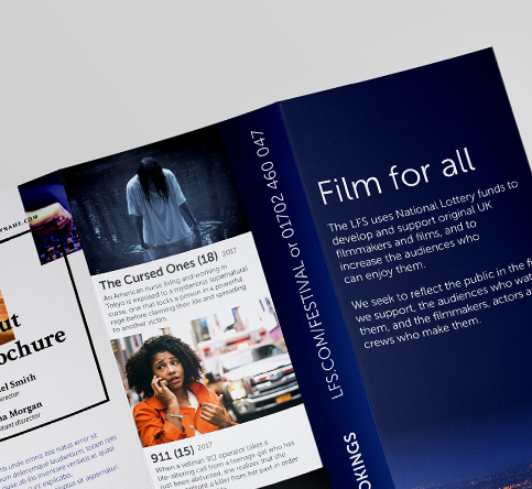
When you’re struggling to generate ideas, there’s no shame in following convention. A classic flyer or leaflet can help you carry your message effectively – without the need to push boundaries with an extravagant design.
When laying out your flyer or leaflet, keep it simple. Create an easy-to-digest format that features clean, clear fonts and self-contained text boxes.
If your audience expects to see a heading at the top of the page with information and imagery below, deliver exactly that. Classic leaflet design ideas with vivid images and minimal text will help you get straight to the point.
2. Monochrome
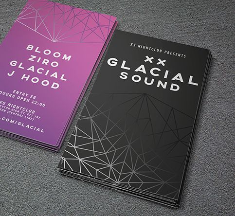
Monochrome can be contemporary, retro, and even starkly modernist. It expresses a seriousness of purpose that characterises your brand as stylish and thoughtful.
You can also try adding a few accents in your brand colours to make your key points pop. A monochrome theme will mean that any additional colours you add will make a bold statement – especially when they emphasise your brand.
It’s a great leaflet or flyer idea for a smart tech company, a creative endeavour or a performing arts event.
3. Colourful
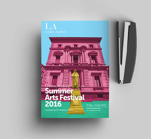
Pack a punch with something eye-catching. If monochrome is not your thing, go all out with an explosion of colour.
Maintain your company message and choose shades that fit within your brand livery for a look that’s instantly “you”.
Or step outside your comfort zone with complementary – or even contrasting – colourways that will stop them in their tracks.
Colourful leaflet designs are ideal for entertainment companies, creative organisations or even traditional businesses who are looking do something a bit different to advertise a sales event.
4. Vintage
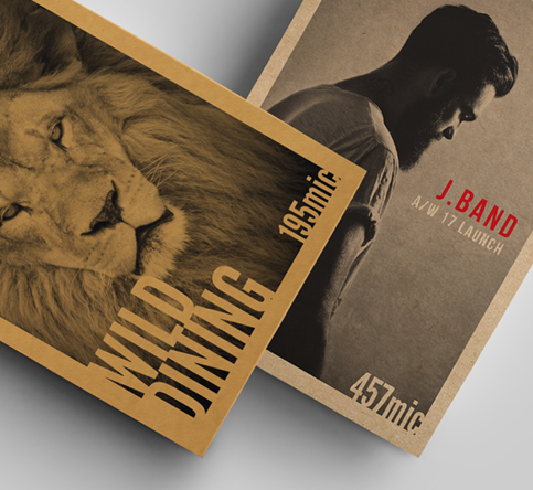
If you want to bring a touch of vintage style to your marketing collateral, you might want to explore retro and traditional styles.
By taking influence from specific historic periods or cultural movements you can create a backstory for your brand.
Brown Kraft paper is ideal for this purpose with its rustic, brown appearance. A burst of bright colour, within either typography or imagery, can add a modern flourish to a black-on-brown design.
5. Statement
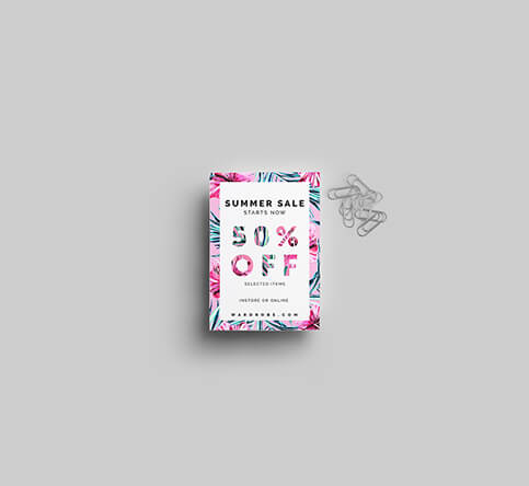
If your event, promotion or product is a bit bold and a bit different, why not create statement flyers and leaflets that reflect that?
Start with dimensions. Maybe try a non-conventional square option? This will help your flyer or leaflet stand out a little more, compared to the usual shapes that are handed out on the streets.
Keep your design simple yet innovative. On a flyer, you might want to keep one side dedicated to design and use the flipside for all your essential details.
What’s a good size for a flyer or leaflet?
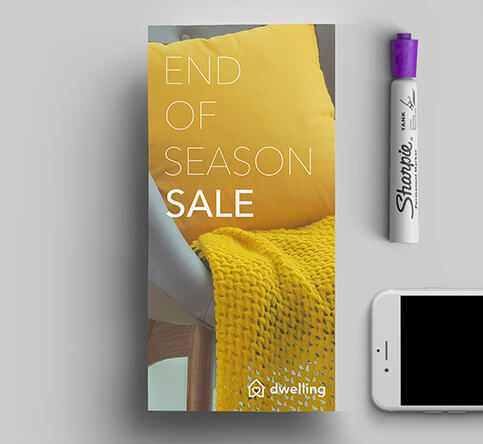
Flyers and leaflets come in a variety of dimensions. Size is a crucial factor when producing a piece that’s big enough to make an impact, but handy enough to carry home.
Here are the most common sizes and how they can help you to create an effective leaflet or flyer:
- A3– more for display purposes, such as a poster or a pinned-up advertorial.
- A4– standard paper size, usually used as menus or guides to display a large amount of information.
- A5– the most common size for letterbox leaflet distribution such as takeaway menus and invitations.
- A6– postcard size and ideal for handing out or delivering through letterboxes.
- A7– popular for on-street flyer distribution and small enough to fit in your pocket.
- Square – a great choice for a stand-out flyer, especially when coupled with a bold design.
- DL – the size of a leaflet created by folding an A4 sheet vertically into thirds – a classic option for folded leaflets.
The dimensions of these sizes are shown in the table below:
| Flyer size | Size in cm | Size in mm | Size in inches |
| A3 | 29.7 x 42.0 | 297 x 420 | 11.7 x 16.5 |
| A4 | 21 x 29.7 | 210 x 297 | 8.3 x 11.7 |
| A5 | 14.8 x 21 | 148 x 210 | 5.8 x 8.3 |
| A6 | 10.5 x 14.8 | 105 x 148 | 4.1 x 5.8 |
| A7 | 7.4 x 10.5 | 74 x 105 | 2.9 x 4.1 |
| Square | 10.5 x 10.5 | 105 x 105 | 4.1 x 4.1 |
| DL | 9.9 x 21.0 | 99 x 210 | 3.9 x 8.3 |
Keep in mind the different paper sizes when organising a specific promotion or considering the various distribution methods.
With Solopress, you can choose from A7 to A3 size flyers and leaflets as well as DL, square and folded styles.
What’s the right type of paper for flyers and leaflets?
Texture and feel are yet another opportunity for your brand to express itself through your flyers and leaflets.
Choices you make regarding the quality and thickness of paper can promote brand values such as luxury, style or the environment, for example.
Commonly used paper stocks for flyers and leaflets include:
- Silk – slightly shiny but not full-on gloss, this is a popular and luxurious option.
- Gloss – the high shine option, gloss is perfect for bringing out bright colours.
- Kraft – 100% recycled Kraft, is rough and ready and provides a natural brown background.
You can also opt for laminated finishes on top of your chosen paper stock such as:
- Laminated – either in gloss or matt, lamination adds surface texture while also providing a layer of protection.
- Spot UV – this is a gloss varnish that’s applied only to selected areas of the print to highlight design elements or create a contrasting finish.
- Foil – choose either gold or silver foil to be applied to selected areas of your design to highlight text or certain design elements.
How to distribute flyers and leaflets
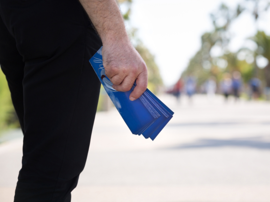
For a comprehensive look at how to get your printed message out there – and how to know if your activity has been successful, check out our guide on the best ways to distribute flyers and leaflets.
The guide will take you through issues around flyering – some expected and some not so obvious. These include:
- Different methods of distributing flyers and leaflets
- Where and when it’s best to hand them out
- The legal issues surrounding where you can and can’t distribute flyers and leaflets
- The implications of handing out flyers and leaflets without permission
- Things to consider when recruiting a distribution partner
- Methods of tracking the success of a flyer or leaflet campaign
From inspiration to implementation
We can help put all this theory into practice with our flyer and leaflet printing service. Choose your size, paper and quantity, then either upload your artwork or have one of our design team create it for you.
You’ll get free UK delivery and an ultra-quick turnaround on your order. Start printing with Solopress today.

