Posters are the original printed marketing tool. They’re used to advertise events, products and services, using striking pictures, graphics and text.
Some of the most iconic pieces of design within pop culture are found on posters. Obama’s ‘Hope’ design, the US’s ‘We Can Do It!’ wartime artwork and the Jaws movie poster – to name a few.
By combining creative composition with clever wording, you can produce an eye-catching poster for your business.
Find out everything you need to know about how to design, produce and distribute your next attention-grabbing poster with our ultimate guide.
When you’re ready to go, Poster printing from Solopress offers top-class support, production and delivery to get your campaign started in style.
What’s in this article?
- What is a poster?
- Why are posters important?
- How to create an effective poster design
- What’s the best design software for posters?
- What poster design ideas could I use?
- How do I design a poster for an event?
- How do I make an advertisement poster?
- What are the different poster layouts and sizes?
- What paper types can be used for posters?
- What is the best paper weight for posters?
- How to distribute posters?
What is a poster?
A poster is a printed advertisement that is used to promote an event, product or service. It combines text and graphics to ensure it is noticed by lots of people and is usually displayed in a public place.
They usually include:
- A bold headline or slogan.
- Succinct copy showing key messages.
- Important information for events or offers.
- Leading image or graphic that supports the text.
- A mix of colours or a monotone scheme, with several shades of the same tone.
By mixing these elements, your poster can attract the attention of those passing by. Famous and iconic posters include:
- Movie posters like Jaws and Vertigo.
- Advertising posters like the Guinness toucan.
- Event posters like Théophile Steinlen’s ads for “Le Chat Noir”.
- Political posters like ‘Keep Calm and Carry On’.
Why are posters important?
Posters are all around us. Wander into any town or city and you’ll see colourful displays at every turn.
It’s clear marketers value their influence. Here’s some of the top reasons why:
- Cost-effective. An event poster does not need to shift many tickets to cover the cost of printing it. They’re cheap to print and ensure a significant return on investment for most businesses.
- Part of a multichannel campaign. Research shows that when an audience sees advertisements in different formats, it helps to build brand awareness and authority. A poster is the perfect way to diversify your marketing campaigns even further.
- Expresses your brand. The emphasis in graphic design allows you to promise excitement, evoke a lifestyle and stir emotions. The fine art tradition of poster design gives you free rein to assert your brand in creative new ways.
- Expected of you. Within certain industries, a poster is the cornerstone of a campaign. If you’re promoting a music event or a movie release, your audience will expect a poster to be chief among your marketing collateral.
How to create an effective poster design
We’ve taken a more in-depth look at some of the fundamentals for composing a poster.
Use colour
Colours have the power to bring out different emotions. Warmer hues like red, orange and yellow depict energy and dynamism. While monochrome colours result in a more serious and straightforward poster.
Whatever you’re advertising, choose colours that:
- Are suitable for the type of promotion you’re running.
- Guide your audience to take the appropriate action you want.
- Represent your branding and in-house style – familiar colourways.
In many promotions, it helps to use striking colours, to direct the viewer’s attention to important pieces of information.
While if you’re advertising a new product or upcoming event, use a fresh, bright palette. This will draw the eye and build anticipation.
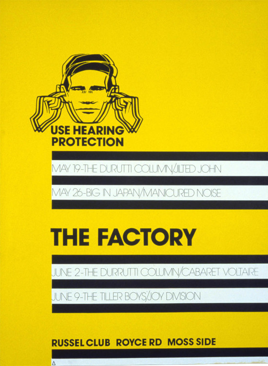
Finally, consider contrasting colours. These can have a big impact, especially if you stick to just two or three. This poster by renowned graphic designer Peter Saville makes fantastic use of black, white and yellow.
Our blog on the importance of colours in print marketing details what your choice of colours says about your campaign, and the fascinating psychology behind it.
Using illustration
Using original artwork on a poster allows you to mix illustrations with vibrant colours to capture the imagination of the public.
Whenever you’re creating artwork, be conscious of the placement and allow room for text – it’s worth knowing your poster size beforehand, so you know how much room you have to work with.
Promoting an exhibition? Try representing the style of your event by using unique illustrations that follow the theme.
Using photography
Photography provides a visual shortcut to set the mood of your poster in an instant. It’s often seen on movie posters or ads for clothing and lifestyle brands.
Utilising the right shot, with appropriate copy and printed on the correct paper, will result in an attention-grabbing poster print.
When using a photograph in your design, add only essential text and keep other design elements to a minimum. This allows the photograph to take centre stage.
Using text
The tone, font and sizing of your text will have a huge bearing on your poster design. These elements will affect the look and feel, accessibility and ultimately the success of your campaign.
Firstly, you need to make sure your font is readable from a distance. Millions of people in the UK face visual and cognitive challenges, including dyslexia, colour blindness, visual impairments, dementia and literacy challenges.
This means some written material is less accessible for them.
Make sure you are inclusive of your entire audience by creating accessible posters. You can learn more about designing for accessibility in our blog.
In most cases, word count should be kept to a minimum. Use as little text as possible to get your message across and leave it at that.
Also, be mindful of the locations your poster will be displayed. Consider:
- Will it be viewed up close on a bulletin board?
- At a distance across a train platform?
These considerations will influence what sort of word count you aim for.
Using fonts
Opt for a bold font in a large size, to draw maximum attention to your message. Feature a forceful headline and include all the important details about your event or product.
Play around with different fonts to see what works. A mix of styles, usually from the same font family, can help keep the viewer’s eyes on your poster for longer. But more than two or three different fonts can look messy and amateurish.
Slender typefaces, such as cursive or graffiti, can be very appealing stylistically, but will make your poster less legible.
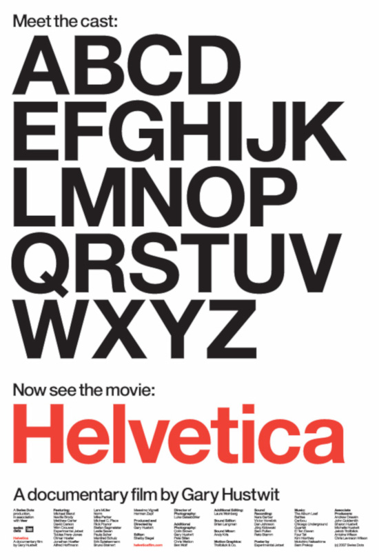
For absolute clarity, sans serif fonts are the top drawer. Helvetica, for example, is such an iconic, modern and readable sans-serif font that they made a film about it.
If movie posters are your thing, check out our guide to the most popular movie poster fonts.
What’s the best design software for posters?
There are various programs to help you design your poster, including the Adobe Suite of apps and Microsoft Publisher. These design tools will allow you to bring text, imagery and illustration together to create your artwork.
Poster templates
As a starting point, download the appropriate poster template from our website, to help you design your poster to the correct specs, using the software of your choice.
Each template is available in the following file formats:
- Photoshop
- Illustrator
- InDesign
Which Adobe app is best for posters?
This depends on which software you’re most comfortable using. Each one specialises in a different area of digital design:
- Allows designers to edit photographic imagery. It can also help you incorporate text and illustrations in your poster design.
- Developed specifically to give graphic artists the tools to create and manipulate vector graphics (illustrations based on digitally defined lines and shapes). Illustrator can incorporate other imagery and text too.
- More of a desktop publishing app. It allows designers to layout pages with blocks of text and imagery. It’s aimed at producing publications with multiple pages, but can also be useful in producing a poster, especially when text and imagery are confined to clearly defined sections.
Free poster design software
If you don’t have access to any of these programs, there are free alternatives. While not as sophisticated or powerful as Photoshop, GimpFX offers a similar feature set.
And with plenty of video tutorials available on YouTube, you could be designing posters in no time – at no extra expense.
What poster design ideas could I use?
We cover the general principles of how to design an impactful poster in our piece about attention-grabbing poster designs.
In our blog hub, we’ve explored inspiration from a whole range of sources. Poster genres as diverse as these have all featured at one time or another:
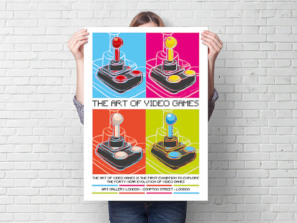
- Video game posters
- Vintage seaside posters
- Cocktail drink posters
- Posters for the Glastonbury Festival
For further inspiration, take a look at poster designs from your own sector. Pick out the most successful and see what they have in common.
Try to determine which elements work best, and where you can bring in your own originality.
For a more general toolkit of design ideas and apps, take a look at our round-up of useful free designer resources.
How to design a poster for an event
Whatever event you are holding, you need to get people through the door. Posters are one of your main tools to help achieve this.
When designing a poster, you need to:
- Capture their attention. Original design that stops people in their tracks.
- Enable them to attend. The information they need to get there on time.
What makes a successful poster depends on the type of event you’re promoting. What would capture the attention of a typical gig-goer may not be the same for someone looking to attend a business conference.
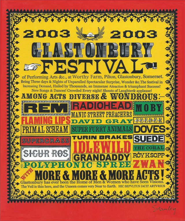
Our design team dubbed this Glastonbury poster a ‘hit’ – highlighting its larger typography and strong colour palette as reasons for its design success.
What information to include
Event posters should include:
- Date – the reader needs to know exactly when your event is taking place.
- Time – when to arrive, when the doors open and the headline act starts.
- Venue – if they don’t know where you are, how can they attend?
- Age restrictions – how annoyed would you be if this weren’t included and you couldn’t attend?
Try not to overwhelm the reader with information. Instead, keep it as brief as possible. Include a link to your website or social media so people can find out more.
Multi-version poster printing
If your event takes place on different dates, or tours between venues, you can take advantage of Solopress’ multi-version posters. This allows you to incorporate multiple sets of details on posters as part of the same order. Learn more about your multi-version poster options here.
How to design an advertisement poster?
Well-designed print ads stay with the reader, attract new customers and bring in huge volumes of sales. Think about the iconic Guinness ‘toucan’ posters or the Coca Cola Santa Claus.
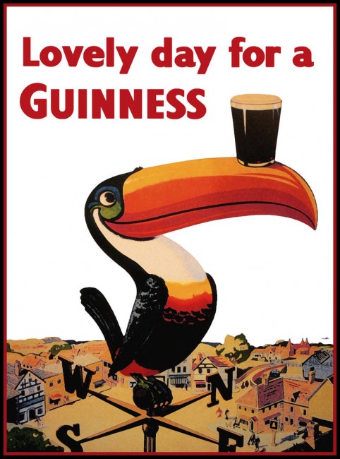
Ensure your message is clear and attractive – people should know what you are selling, and why they need it. Develop slogans and short copy that transform the features of your product into lifestyle benefits or capture the imagination with clever wordplay.
Include a call to action – what do you want someone to do when they’ve seen your ad? Craft a compelling line that inspires them to act.
What are the different poster layouts and sizes?
Posters come in all shapes and sizes. But the dimensions you pick will have an effect on:
- How well your audience engage with the poster.
- How it’s perceived.
- Whether it communicates effectively in the space it’s displayed.
Should your poster be portrait or landscape?
If you’re advertising a gig or a one-off event, portrait posters are the traditional choice. They’re ideally suited to make text-heavy designs accessible to readers.
Landscape posters generally suit photography-based designs. They’ve become an industry standard for artworks like movie posters.
Your choice of landscape or portrait won’t affect how your print is produced or the costs.
For something outside the norm, our strip posters are portrait-style but with extra room to work with. They’re available in A3, A2 and A1 sizes.
Content layout
It’s important to follow a hierarchy of information when designing a poster. Write down every element you need to get across and then arrange them into a top-down list by priority.
A typical list would look like:
- Name of event/product/ service.
- The brand behind it.
- A short description/tagline.
- Further details, such as time, date, review score or statistic.
- Location.
- Where to find out more – phone number, URL, QR code.
Remember not to overload your poster with information. Try to keep it legible and accessible to all.
What poster sizes are there?
A poster can range from a small A4 sheet to a full floor-to-ceiling display. The size that best suits your brand and design depends on the impact you hope to achieve and where it’s going to be viewed.
If you’re planning an indoor location for your poster, it’s best to choose a more compact size to fit the smaller space.
Larger posters, such as our B-series, will have a greater impact on audiences through sheer size alone. Plus, you have a bigger canvas for your design.
Here are the different poster sizes available at Solopress, and what they’re commonly used for.
Multiple locations
Small posters are a cost-effective way to promote in several locations. These sizes are perfect for displaying in and around the community:
- A4 – 210 x 297mm or 3 x 11.7in
- A3 – 297 x 420mm or 7 x 16.5in
Getting noticed
Medium-sized posters have more space for larger text and graphics, without being outlandish. These sizes can help your promotion get noticed:
- A2 – 420 x 594mm or 16.5 x 23.4in
- A1 – 594 x 841mm or 23.4 x 33.1in
- A0 – 841 x 1189mm or 1 x 46.8in
Conveying lots of information
Large posters demand attention. Their size gives you plenty of room to include all the details about your event, promotion or product:
- B2 – 500 x 707mm or 19.7 x 27.8in
- B1 – 707 x 1000mm or 8 x 39.4in
- B0 – 1000 x 1414mm or 39.4 x 55.7in
The Solopress line-up
Here’s a comprehensive guide to the poster sizes we print:
| Poster size | Dimensions | Usage |
| A4 | 297 x 210mm | Perfect for doors and windows — or to double as a flyer |
| A3 | 420 x 297mm | Great on notice boards or in smaller spaces |
| A2 | 594 x 420mm | Make an impact in stores, homes and galleries |
| A1 | 841 x 594mm | Our most popular size — a classic eye-catching poster |
| A0 | 1189 x 841mm | A large-scale poster that makes a big impression |
| A3 | 594 x 210mm | Perfect for displaying on columns around stores |
| A2 | 841 x 297mm | A striking shape – great portrait banner |
| A1 | 1189 x 420mm | An ideal scale for portraying people and characters |
| B2 | 707 x 500mm | Performs brilliantly in windows |
| B1 | 1000 x 707mm | Can communicate over great distances |
| B0 | 1400 x 1000mm | Oversize theatrical posters with the ‘wow’ factor |
| 20 X 30 | 508 x 762mm | A handy size in-between A2 and A1 |
| 30 X 40 | 762 x 1016mm | The classic landscape, cinematic poster size |
| 40 X 60 | 1016 x 1524mm | A popular large-scale window poster |
If you need a poster in a non-standard size, contact us and we’ll do our best to meet your needs. For more information on poster sizes, including non-metric dimensions, you can check out our complete poster size guide.
Once you’re settled on the size, you can download a poster template to help your artwork fit your poster size.
What paper types can be used for posters?
Your choice of paper can say a lot about what you’re promoting. The key is to match your paper type to your subject, not just your budget.
When we talk about types of paper, we’re referring to a combination of three things:
- Stock – the material that the poster paper is made from.
- Finish – a coating or varnish applied to the surface to give texture and durability.
- Weight – the thickness of the paper, usually measured in grams per square meter (gsm).
What are the best paper stocks and finishes for posters?
We have posters in a range of stocks and finishes, each with its own usage and benefits.
Gloss
Premium, high shine surface which expresses quality and luxury. Gloss also protects the paper stock and lends durability to your poster.
However, this finish can reflect light, causing glare. Consider the conditions where your poster will be displayed.
In the right context, the visual appeal of a gloss finish poster can really pack a punch.
Bond
Bond paper is cost-effective and eco-friendly, without compromising on quality. The finish is also less reflective than gloss.
Bond is an industry-standard paper stock. This means you’ll have a full choice of classic poster sizes at your disposal in a range of thicknesses.
Day-Glo
A popular choice for outdoor displays. If you want to promote an event or product, Day-glo poster printing can inject a shot of excitement.
Fluorescent green, orange, pink or yellow provide the backdrop to an unmissable message.
It’s not for the faint-hearted though, and you may wish to think twice before using Day-glo for high-end luxury goods.
Check out our blog to learn how to design a day-glo poster.
What’s the best paper weight for posters?
Paper stocks for posters usually vary between 130 – 350gsm. We recommend a 170gsm for most poster sizes, as it’s a thicker paper, durable enough for outdoor use
If you need light box posters, we offer a dedicated paper stock for that purpose.
Your paper weight can also be influenced by your choice of finish. For instance, bond is already considered strong and durable, so you may not need the extra thickness. Silk paper offers a velvety smooth finish which benefits from a heavier stock.
Choose the right finish and weight with our guide to paper types.
How to distribute posters
Consider how you plan to distribute and display your posters before you begin designing, as this can affect your decision process.
Onsite options
If your business is open to the public, you can communicate with your audience onsite. Use your windows to encourage footfall. Then, when they visit, capture their attention with posters displayed around your walls, columns, doors and counter areas.
Offsite posters — both indoor and outdoor
Place your posters in sites with heavy footfall, road traffic, or where your audience is likely to gather. Identify the locations that will work for you and explore your display options.
If you’re part of a shopping centre, ask yourself:
- What do the centre management offer?
- Are there poster sites around your town?
Do some research to discover whether they are council-run or privately managed.
Remember that flyposting (displaying promotional posters without permission) is illegal. In England and Wales, it could land you with an £80 fine, a fixed penalty notice or an appearance before a magistrate as well as the cost of removing your posters.
If you have far-reaching ambitions for your poster campaign – and a budget to match – you can bring in an agency to look after your outdoor ads. They’ll help you spread your message on commercial billboards, public transport and beyond.
Now you have these tips and tricks at your disposal, your poster could be turning heads in no time.
With quick turnarounds and free standard UK delivery, print posters with Solopress today.
Related Pages
Poster printing
Ready to print? Check out our extensive range of different paper stocks, finishes, shapes and sizes.
Poster templates
Download free blank templates ready to be edited in InDesign, Illustrator or Photoshop
Poster size guide
Dive into our guide to Poster sizes to discover the different types available and find the best match for you.

