In our first ‘Start-up Stories’ blog, we introduced Dave Roberts and his brand new company, Ancoats Guitars. We’ve teamed up with Dave so that we can follow him through the challenges and adventures of his first year in business and support the company with top-quality print.
In month two, things are getting exciting. On the horizon are media appointments, new product development, fresh stationery, trade shows bookings and more. Before getting carried away, though, Dave had a little more work to do to establish a brand identity and house style for Ancoats Guitars.
Refining the logo
Ancoats Guitars is a new business, but like most entrepreneurs, Dave had a good idea of what his logo and branding might look from the very outset. As discussed right at the end of our last blog, Dave’s logo was strong, but required some minor, yet essential development before it could fulfil all the roles that are required of it.
Through discussions with graphic designer Matt Bruty at Solopress, Dave and Matt were able to refine the logo, as well as adapting it for a range of essential applications.
These applications were as diverse as branding the company website at ancoatsguitars.co.uk, representing the company as social media avatars and appearing as decals on the guitars themselves. And of course as well as appearing on small and large format printed materials.
A site better
With work on the logo iterations complete, there was a strong foundation in place to build a broader brand identity, starting with the website. Dave was able to take Matt’s work and apply it across each webpage. The result was a smart, reskinned site with a consistent style throughout.
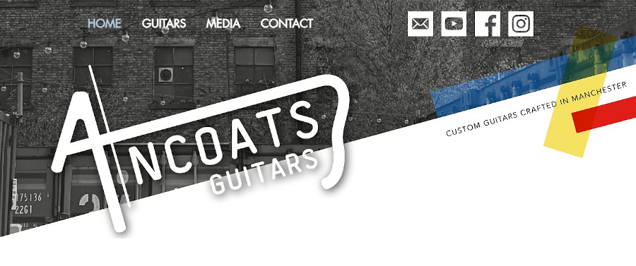
The decision-making and development that went into the redesign of the webpages also helped to crystallise Dave’s sense of what he does and doesn’t want from the look and feel of the brand. So let’s delve into the importance of design for this company, and the influences that have helped determine its direction so far.
Defining a style
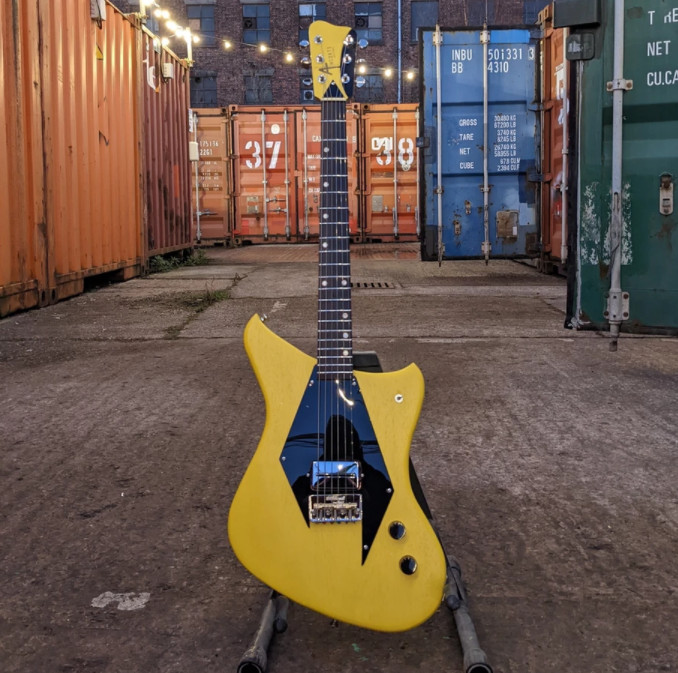
Outstanding design is such a point of difference for Ancoats Guitars that it was essential that the colour palette, graphic elements and stylistic flourishes that go into the instruments should be woven into the company’s branding too. The focus of this month has been to establish a visual approach to take through to all of the print projects that lie ahead.
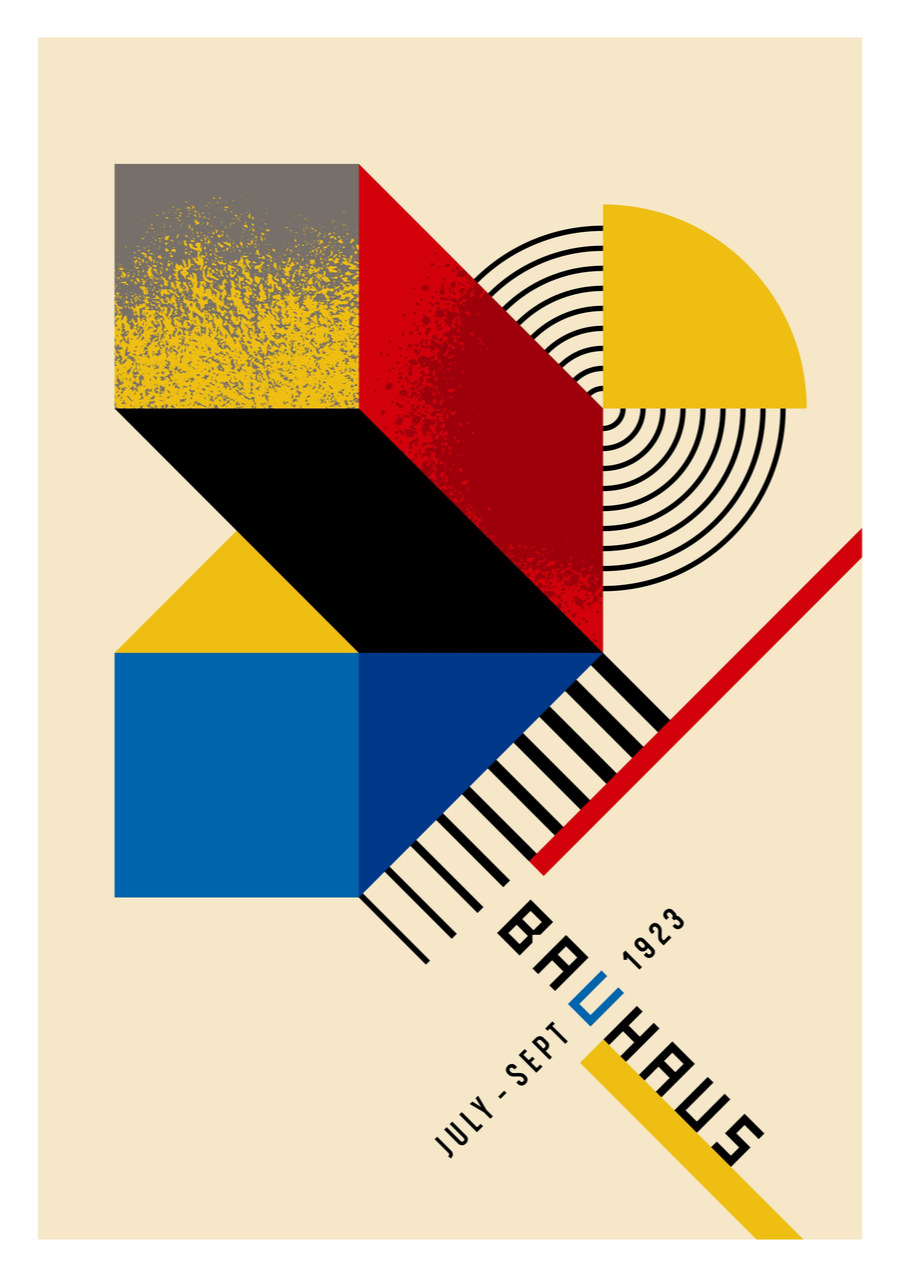
A major influence on the Ancoats Guitars aesthetic is European modernist art house design. Work that sprang from the Art Deco and Bauhaus movements informs a lot of the colours, lines and shapes that appear on the guitars themselves. It made sense to reference these styles throughout the brand design too.
Straight out of the blocks
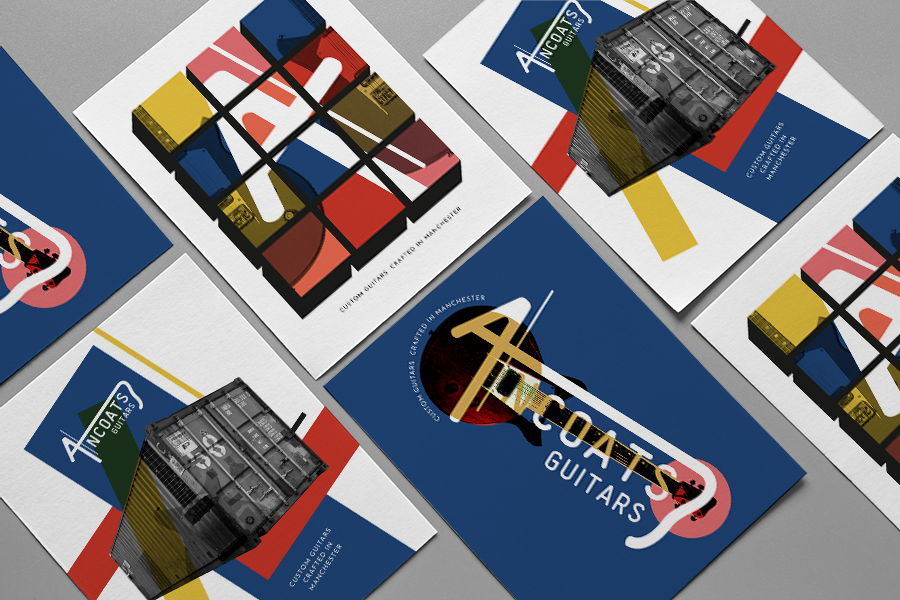
A recurring design motif that Dave and Solopress designer Matt settled on was a Bauhaus-inspired arrangement of red, yellow and blue semi-transparent blocks that could serve as holding devices for graphic elements, both online and in print.
The Bauhaus was an art school in Weimar Germany, founded in 1919 by architect Walter Gropius. The teaching faculty was staffed by such luminaries as Russian painter Wassily Kandinsky and the architect Ludwig Mies van der Rohe.
The school merged art, design and architecture to develop a style of angular modernism featuring clean lines, simple shapes and often bright colours. That was up until 1933, when an Austrian-born former-artist with a rather different vision for Germany took power in Berlin and forced the school to close for good.
From modernist to modern
The geometric shapes and primary colours that feature in the Ancoats Guitars brand may have been inspired by the Bauhaus movement of the last century, but they have a timely resonance with the company’s contemporary location too.
 Dave operates from a repurposed shipping container, overlooked by the monolithic mill buildings that the Ancoats district is known for. The combination of these brutal forms with the vivid colours associated with the city’s music scene creates a look that’s distinctly Mancunian.
By evoking this potent combination of heritage, location, design, and of course music, Matt and Dave have come up with a look and feel that’s both fresh and aware of its roots.
The brand expands
Which is all very well, but can you put all that on a Business Card? In a sense we think you can…
For any new enterprise that wishes to be taken seriously, a smart set of stationery is a great way to appear professional and business-like.
But that doesn’t mean these elements need to be stuffy and formal, especially with a product that’s as exciting as electric guitars. When you want to express a brand that’s fun or edgy, but you also express need to express your seriousness as a business, there is a delicate balance to be struck.
By all means include the design flourishes that make your brand what it is, but don’t try to reinvent the wheel. After all, business people have certain expectations and requirements of the stationery that you use.
In this collection of elements designed by Dave and Matt, they’ve managed to put the distinctive Ancoats Guitars branding centre stage, while creating a functional and professional set of Business Stationery.
Flyers, Posters and beyond
When it comes to out and out promotional materials, however, Matt and Dave were able to take the foot of the brake and come up with some bolder designs that were more in keeping with this kind of print.
The designs that they arrived at incorporate the newly designed logo and wordmark, the Bauhaus colour blocks, plus there’s something about the use of colour and repetition that feel very much at home on the Manchester music scene.
Off to print
We’re very proud then, after this initial period of design and preparation, to be sending our first elements off to print. Stay tuned for our next instalment of ‘Start-up Stories’ when we’ll have a look at how, why and where Dave will be using his printed materials to promote Ancoats Guitars.


