Learn how to design a Poster in Adobe Photoshop with our expert, easy-to-follow video tutorial…
This video is part of our Adobe Creative series of design tutorials. Please make sure to subscribe to the Solopress YouTube channel so you don’t miss out on future guides!
How To Design A Poster
Head to the Solopress website (www.solopress.com) to download the free Photoshop Poster A0 template guide as a base for your poster.
Open the Photoshop file, we have created a guide layer that will help you design your wedding invitation – this includes the bleed area, trim and safe area.
Bleed Area – Anything here will be trimmed off, but remember to extend any colouring or images into this 3mm bleed area to avoid white lines appearing during the print finishing stages.
Trim – Your job will be cut on the solid black line, any images or text placed in this 3mm area may be trimmed off incorrectly.
Safe Area – Keep all your information insides the white area. Remember to use high-resolution images (300dpi) for the best results.
Create a new guide by clicking and dragging on the vertical and horizontal Ruler (if your Ruler does not appear in Photoshop press Command + R).
Create 4 new guides on the safe area line. In this video I have created 2 lines that run through the centre vertically and horizontally, you can set these to the exact measurement by clicking View – New Guide then entering 420.5mm for vertical and 594.5mm for horizontal.
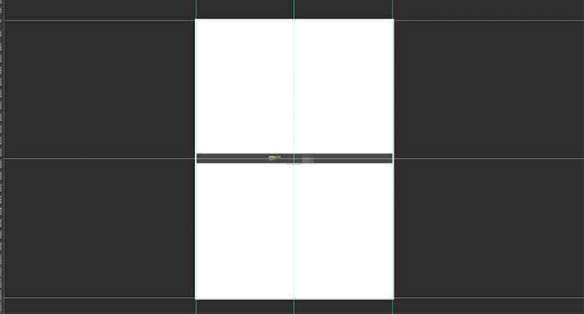
Let’s get started!
Now you’ve got your guides in place, we can now get started on the background. To make a solid colour background click Layers-New Fill Layer-Solid Colour. In this demonstration I’m using a fill colour instead of an image or pattern because I am going to add shapes to give it depth.
I now start adding my shapes by dragging in the images from my folder, When you drag in an image, you will instantly have access to scale, rotate and flip the image. If you want to change any of those options after the image has been placed, select the layer and click Edit – Transform. I place my lines image and I want to copy it to make a pattern. To copy an image, right click the layer and select Duplicate Layer.
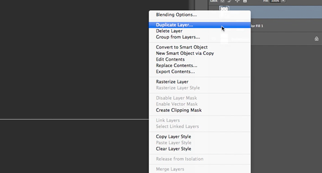
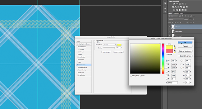
When adding my chevron pattern image, I changed the colour of the image. To do this, right click the layer and select Blending Options. You can overlay solid colours, gradients and patterns in this window, as well as add strokes, drop shadows and change the layer’s opacity.
Now it’s time to add text, to do so select the Text Tool in the side bar, click anywhere on your project and start typing. You can change font, size, line spacing and more options using the Character Panel, which is accessible on the basic text option bar at the top. You can scale (I wouldn’t recommend, change the font size instead), rotate, flip etc. using the Edit – Transform function I mentioned earlier.
After all of my text and images are in place, I want to add bars for my header and footer. I used the Rectangle Tool in the side bar to draw out the shape I needed. Then I changed the appearance using the Blending Options.
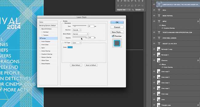
To stop losing the white text in the patterns, I used Blending Options and made a stroke the same colour as the background, then reduced the opacity to blend.
When your happy with your design, remember to delete the template layer!
To get ready to send it to print, save it as a PDF using the options in the Save As menu, then follow the instructions on the Solopress website.
So here’s a rocking poster for festival season!
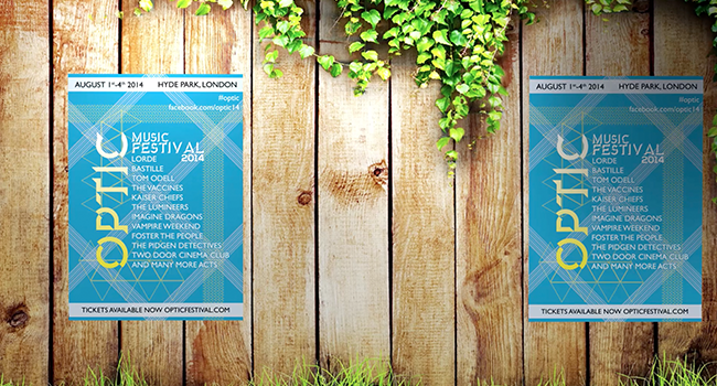
If you have any comments or questions regarding designing ready for poster printing, please use the comments section below and we’ll do our very best to answer your queries.
Thanks for watching our video tutorial!


Thanks for the tutorial. I need to create some posters for a charity event we’re arranging, I don’t currently have Photoshop but it’s definitely something I will look into (depending on cost) as the poster you have created looks really professional.
I couldn’t make out what the triangular grid arrangement was. It seemed to be a pasted-in image, but couldn’t make it out.
Very useful, thank you 🙂
Very informative thanks
Love reading photoshop tutorials, there’s always something new I can learn
This is so useful and interesting. Thank you