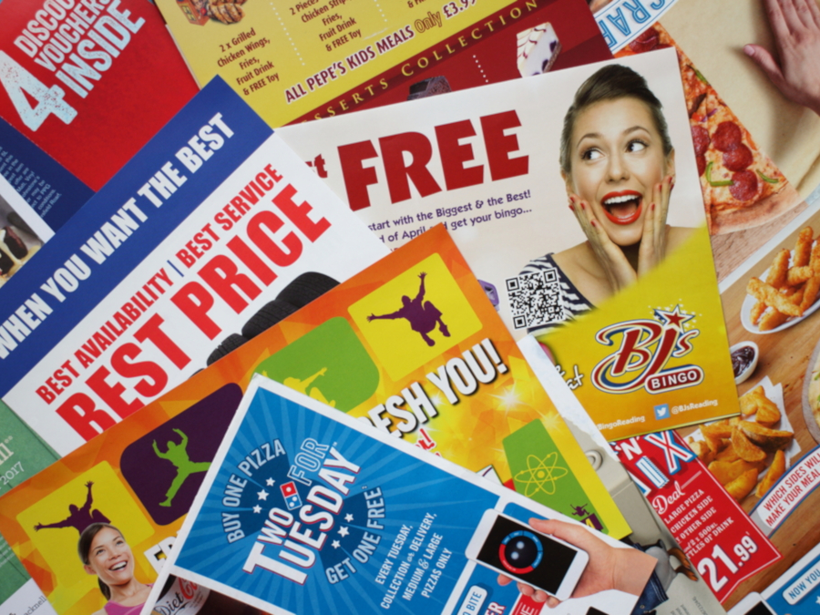
Here is your ultimate guide on how to design Flyers and Leaflets ready for print. In this guide, you’ll find out our top tips for creating an effective Flyer to turn your latest campaign into a marketing triumph.
Video tutorial
To start, our graphic designer Matt Bruty takes you through how to design Leaflets for print in this video tutorial. Keep your ears peeled for some professional tips!
Matt has also created specific tutorials on how to design Flyers in Photoshop and how to create Leaflets in Illustrator if you are using either of these Adobe editing tools. You can also view a full transcription of this tutorial here.
For further information on how to get the most out of Adobe’s design apps, there’s a whole series of video tutorials to explore when you subscribe to our YouTube Channel here:
Our 10 top Flyer design tips
Now you’ve watched Matt design a Flyer, read our 10 top tips on how to create an effective Leaflet in order to turn your latest campaign into a marketing triumph.
- Choose the correct size
- Plan your content
- Follow brand guidelines
- Write a strong headline
- Use language that sells
- Make your text scannable
- Pick a powerful image
- Make it look professional
- Set your artwork up correctly
- Track the results
1. Choose the correct size
Custom Flyers come in a wide variety of sizes, each is suited to different purposes. Here are the most common sizes and their effectiveness for each type of marketing campaign:
- A7 – Popular for on-street Flyer distribution and small enough to fit in your pocket.
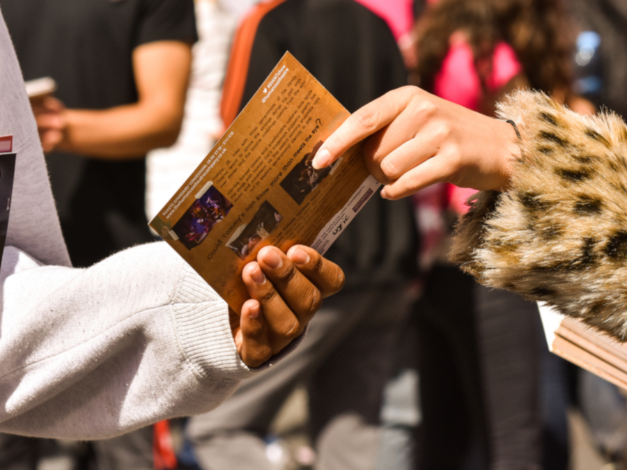
- A6 – Postcard size and ideal for handing out or delivering Flyers through letterboxes.
- A5 – The most common size, they are often used as marketing materials to promote both small businesses and larger organisations.
- A4 – Standard paper size, usually used as menus or guides to display a large amount of information.
- A3 – More for display purposes, such as a poster or a pinned-up advertorial.
Keep in mind the different Flyer dimensions when organising a specific promotion or considering the various distribution methods. There are also many different types of Folded Leaflets available which allow you to present your information in lots of interesting and engaging ways.
2. Plan your content
Before you even start designing, you must make sure you have a clear idea of the job your Flyer has to do. Are you using your Flyers for advertising a product or service? What is the message you want to deliver? What action does a person have to take after reading the Flyer? The purpose of a Leaflet should be your core focus before you start to create your design.
Consider the space you’ve got before you decide on your Flyer design ideas. It’s tempting to tell your potential customers about everything your business does whilst you’re going through the trouble of making a Leaflet. Avoid that temptation as this is often to the detriment of the way the Flyer looks and performs.
Too much info can look like clutter and can often result in a discarded Flyer. You have a matter of seconds to grab someone’s attention, so it’s better to have one or two appealing messages that catch people’s eyes and point them to a website, or social media channel where they can pick up more information if they want it.
This is the most important stage of designing a Flyer. If you can get this to work, then the rest of the design will come together much easier.
There may also be essential information that you cannot afford not to include. For example, if you are creating an event Flyer, information such as the date, time, location and ticket prices are all important details. Make a list of these before you start and tick them off before you finish.
3. Follow brand guidelines
Brand guidelines are there to tell you what fonts, colours, and rules to use when designing in the company’s image. If you haven’t got brand guidelines to work with, then as the designer it becomes your role to create your own rules to make your masterpiece in the image of your brand.
Create a colour palette for your business Flyer. You may only have your company’s logo as a clue to the company’s branding. From here you could pick the colours from the logo and then you can use Adobe’s colour guide to find complementing colours. Try to keep to three or four colours.
Try to match the font in your logo and then try to use fonts that complement that kind of header text or logo text.
Preferably, don’t pick a font that’s similar but not the same because that could visually clash and look unprofessional. Also, try to choose fonts that match your brand’s personality. If you were a traditional undertaker, you wouldn’t use comic sans when designing a Flyer.
4. Write a strong headline
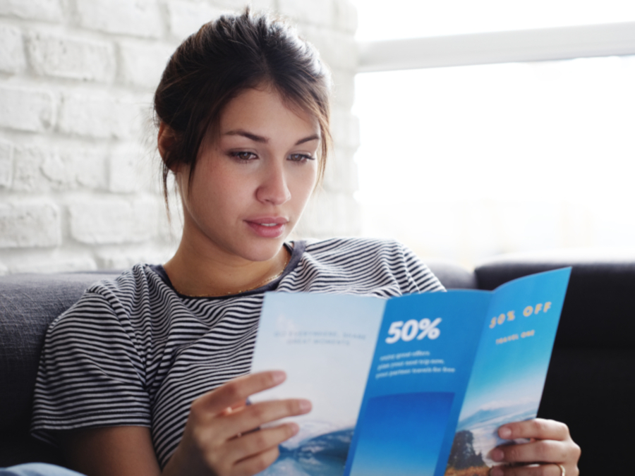
Most people will pick up a Leaflet that comes through their door and discard them after a quick glance.
That means you have a short window in which to grab their attention. Don’t use your business name or product category as the headline. Instead, create a tagline that generates interest.
Find out what’s important to your customers and incorporate that into your leading line. Catchy headlines work, but they need to relate to your business and the content presented in the rest of the design.
Additionally, discounts or sales work well at enticing the reader to pause and read your Flyer in more detail.
5. Use language that sells
Language is a powerful tool. The right copy can be the difference between a sale and a fail, so Leaflet writing is an important topic.
The language you choose should evoke certain feelings in your audience and communicate how your company is best suited to them.
Whether that’s ordering dinner using a printed Menu, considering who to vote for after reading political Leaflets, or deciding on something to do at the weekend – use the wording that places you as the solution.
For sales Flyers, you might want to include attention-grabbing copy such as “exclusive,” “free,” “bargain” or “earn”.
6. Make your text scannable
Displaying information in an easy-to-read manner is a sure-fire way to get your point across quickly. Bullet points are a good start – giving the reader the information they need in a digestible way, this includes:
- Add a Call-to-Action (CTA) – What do you want people to do after reading your Leaflet? Include a phone number for your business, or information on how to get involved in your scheme or event.
- Consider spacing – Space out your copy. Cramming text into a small corner of your design is going to leave it unreadable and unengaging.
7. Pick a powerful image
An image says a thousand words, as the old saying goes. Eye-catching visuals are more effective than 500 words of copy.
Studies show that information displayed in images is digested faster by the reader. So, including images and logos in your Flyer and Leaflet design is important, as it helps break up any text you may have.
Top tip: Make sure the images are relevant to what is being said, or the brand image you want to portray. Services such as Shutterstock or iStock offer a huge selection of stock photos if you aren’t able to create these images yourself.
8. Make it look professional
Investing in a high-quality, professionally designed Flyer or Leaflet can make all the difference between gaining a new customer or losing one. Unprofessional-looking Flyers and Leaflets which are overloaded with information, badly designed or unreflective of your branding can have a negative effect on your company.
Spending time and money on modern designs and professional printing can enhance your image and build confidence that you’re the right choice for your customers. To help, we have created a guide to help you understand the pros and cons of different paper types and choose the one that best suits your brand.
9. Set your artwork up correctly
Create the correct sized canvas for the Leaflet dimensions you have chosen to get your template in place. In our video which we take you through this stage, our designer Matt used an A5 Flyer canvas which was 148mm wide by 210mm high.
If you need a hand at this point, check out our support guides on our website which are full of useful information for getting your design ready to print.
You need to add a 3mm bleed to every edge of your Flyer design as these areas will be trimmed off when printed, so make sure you don’t have anything important within your Flyer’s bleed.
Set the colour mode for your design to CMYK. This is important because if you designed a Flyer in RGB for example, you’re not going to achieve the same vibrant colours when the job goes to print.
We offer several free Leaflet templates which you are able to download and use to help set your artwork up correctly.
10. Track the results
A well-designed Leaflet may grab a potential customer’s attention, but the only way to successfully monitor its effectiveness is by tracking.
You can track each Flyer or Leaflet success by printing a different phone number, promotional code or even QR code to the design.
Only by tracking your campaign can you see what kind of response you are receiving and whether your distribution has been a success.
You could even create different versions of your Flyer using unique designs to determine which style produced the best results.
Summary
So now you have everything you need to create the perfect Flyer, what are you waiting for?! Once you are done and it’s time to go to print, remember that our range feature some of the lowest prices and fastest turnarounds anywhere in the UK!
Video transcription
This video is one of a three-part series showing you the principles and techniques I use to make a visually engaging and effective Flyer that’s also print-ready.
This video covers an overview for setting up for print and best design practices. If you want to skip to how to design a Flyer in Photoshop or Illustrator, please use the available links here or listed below. In this section, I’m not going to get into the technicalities for Adobe Illustrator or Photoshop but give a brief overview of setting up for print.
So before you do anything, you need to create the correct size canvas. In this case, I’m designing a single-sided portrait, A5 Flyer which is 148mm wide by 210mm high. We have our handy support guides on our website. I’ll put a link below that will help you with document sizes.
The next thing to do is to add a 3mm bleed to every edge of your Flyer design. Now, all these areas will be printed and then trimmed off. So anything in your design that’s going to the edge of the page needs to continue for that extra 3mm. When it’s trimmed off, you’re going to be left with a nice image right to the edge of the Flyer. If you didn’t have that bleed and the cut was slightly off, you could be left with a very thin, unsightly white line at the edge of your Flyer.
The next thing to make sure you do is to set the colour mode for your design to CMYK. Now, this is crucial because, if you designed a Flyer in RGB for example, you’re not going to achieve the same colours when that job goes to print. In this example shown here, particularly, neon blues and pinks will just not print. They just, they almost disappear. So it’s best to design in CMYK so you get a much better idea of the finished print you’re going to get.
Design approach – so what is a Flyer’s purpose? Before you even start designing, you have to make sure you have a very clear idea of the job this Flyer has to do. What is the message it has to deliver? And what action does a person have to take, that’s reading the Flyer?
Consider the space you’ve got, it’s very tempting to tell your potential customers about everything your business does whilst you’re going through the trouble of making a Leaflet but that is often to the detriment of the way the Flyer looks and performs. Too much info can look like clutter and would often result, I imagine, in a discarded Flyer. Better to have one or two appealing messages that grab people’s attention and point people in the direction to a website or social channel where they can pick up a lot more information if they want it.
Once you’ve gathered all the information you need to go on the Flyer, it’s time to start placing the elements onto the page. Now, at this stage, I don’t worry about fonts, cutting out the image, any of that stuff. The main aim at this stage is to gain a hierarchy of the messages on the Flyer – where you want people’s eyes to go first and that sense of space.
This is the most important stage of designing a Leaflet. If you can get this to work, then the rest of the design will come together so easily. If it doesn’t work at this stage, you’re going to be forcing it right through to the end. If it’s not working now, you need to probably change something. You might have to look at a new image or possibly cut down the amount of copy you’ve got on the Flyer.
So now you’re in a good place. You’ve got the message you want to deliver. You’ve got the elements you need. You’ve got a very good idea that that’s going to work on the size Flyer you’ve got. So now it’s time to start finessing the design.
Now, whichever brand the Flyer is for, they would have a look or brand guidelines to follow. Brand guidelines will tell you what fonts to use, colours, and rules for using the company logo. If you haven’t got brand guidelines to work with, then it becomes your role as the designer to create your own rules to make the Flyer look good.
At this stage, you can create a colour palette for your Flyer. Now you may only have the company’s logo as a clue to the company’s branding. So you could colour pick the colours from the logo and then you can use Adobe’s colour guide to pick complementing colours or there are online tools as well for doing that and as a general rule, I try and keep to a limited colour palette. It just has a slicker look, if you can keep it to three or four colours, possibly five, and of course, it depends on the branding, I find you get a better result.
So now it’s time to pick your fonts and again, use the logo as a starting point. If you can match the font in a logo, if that works well for headers, then that’s great and then try to use fonts that complement that kind of header text or logo text.
Definitely don’t pick something that’s similar, that’s not quite the same because that could really clash visually and look quite unprofessional. Also, try to choose fonts that match your brand’s personality. It’s a bit of an extreme example but you wouldn’t use comic sans if you were designing a Flyer for a traditional undertaker.
When choosing your fonts, it’s worth finding font families that come in a wide range of weights and italics, varying the weight of keywords in a paragraph can do wonders for making a body of text more palatable. For font sizes, as a general rule, don’t go under nine-point for paragraph text and if you need a bit of small text on there, try not to go below six-point.
For your images, you want good quality. Ideally, you want 300 DPI quality for print at the physical size you want to use it, but you can get a good idea just by zooming into an image and if you’re seeing pixels, don’t use it. Equally, don’t go too far the other way. If you’re using ginormous images that carry a huge file size, it will really slow down the program you’re working in and also it can cause quite a few problems later on when you go to print.
I know I’ve mentioned space already, but I think space is just as important a design tool as images, fonts and colour. Don’t feel the urge to fill a gap just because it’s there. Space helps make your Flyer easier on the eye, with a clear distinction between messages.
Look again at these two examples of the cluttered Flyer and the Flyer that’s got more space. Now I want you to think about how your eye travels through the design that’s got more space. First, I see that image of the cat and then I’m reading the headline. So I know what’s on offer here, and then I slowly digest the other parts of the Flyer.
Then if you look at the other Flyer, my eyes are going all over the place and actually not stopping to digest anything. I think I’m searching to get the main message and I find it really difficult to look at.
The last bit about the design is, if you can, is to add little touches of professionalism, little interactions between the different design elements, things that make all the elements combine as one and that can really help.
Just look at the example here. Just by adding a little bit of drop shadow on the cat’s paws, I think just gives so much more of a professional look. Whereas if you compare it to the other version, it just looks a bit cut out. It’s not quite in the design.
I hope that’s been helpful. Don’t forget to check out the other two videos in the series and we’ll see you for the next one.

